The CLIENT
Fandango
Fandango is a digital network for all things movies, serving over 67 million unique visitors per month, ticketing to more than 45,000 screens, trailers and original video, home entertainment and fan merchandise. Its portfolio includes Fandango, MovieTickets.com and Flixster, as well as world-renowned movie review site Rotten Tomatoes and Movieclips.
My Role
UX Researcher & Designer
The purpose of our project was to collect user research in order to better understand the most effective way to integrate Fandango’s proposed feature idea which was to sell tickets to local live events. We then had to take those insights and create wireframes to integrate it into Fandango's existing platform.
The problem
Our team was brought on to integrate a new feature onto Fandango's existing platform. They wanted to include local live events in addition to their existing product where they provide information and tickets to movies.
problem Statement
How might we...
Help people purchase both movie tickets and event tickets in one place?
Research
We started this process by creating a hypothesis and identifying key assumptions about user behavior. We then sent out a screener to find existing Fandango users who've purchased tickets online to at least one live event in the past year.
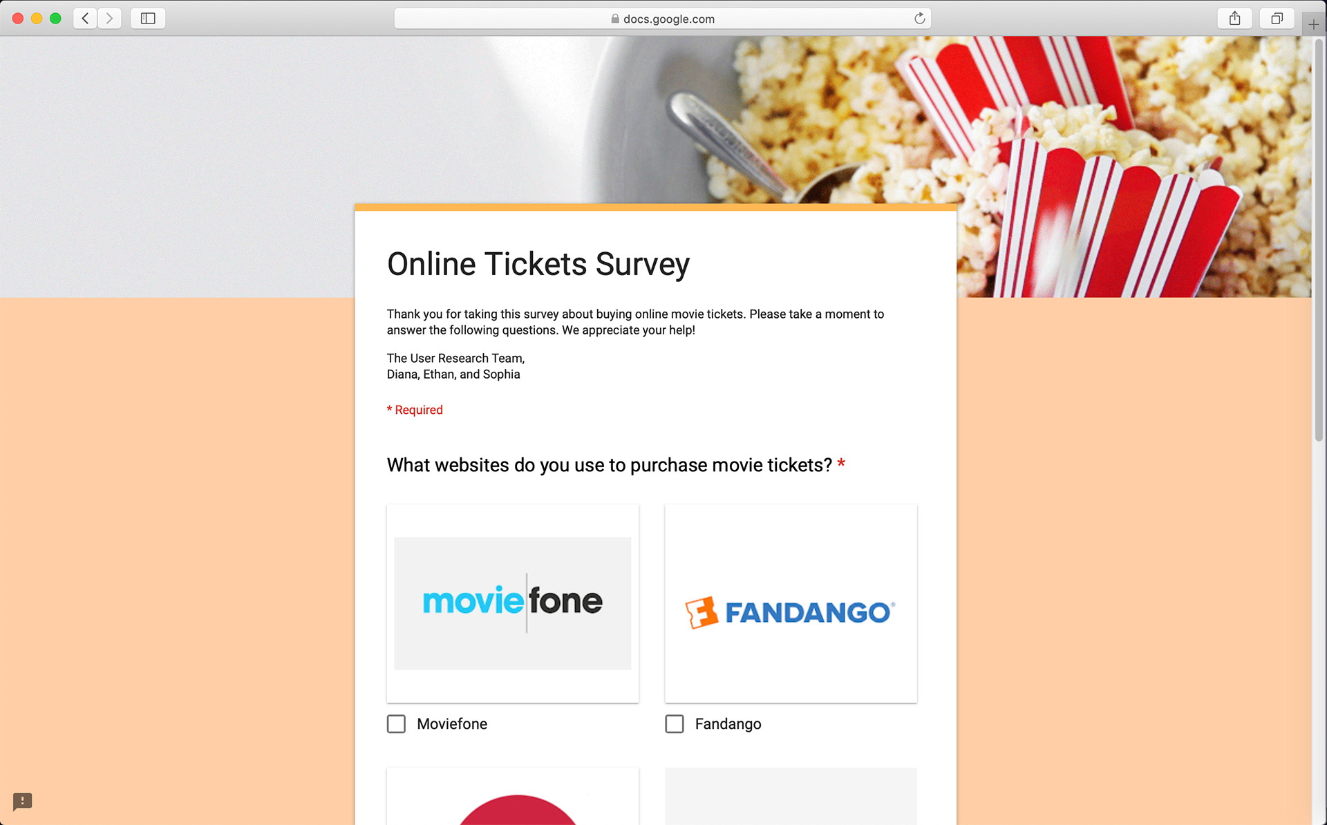
A screenshot of our screener survey where we screened for Fandango users and also purchased tickets to live events online
Once we found people who qualified, we conducted five user interviews. We then used their responses to create an affinity map to identify any patterns or similar groupings of responses. Below is an affinity map of their responses:
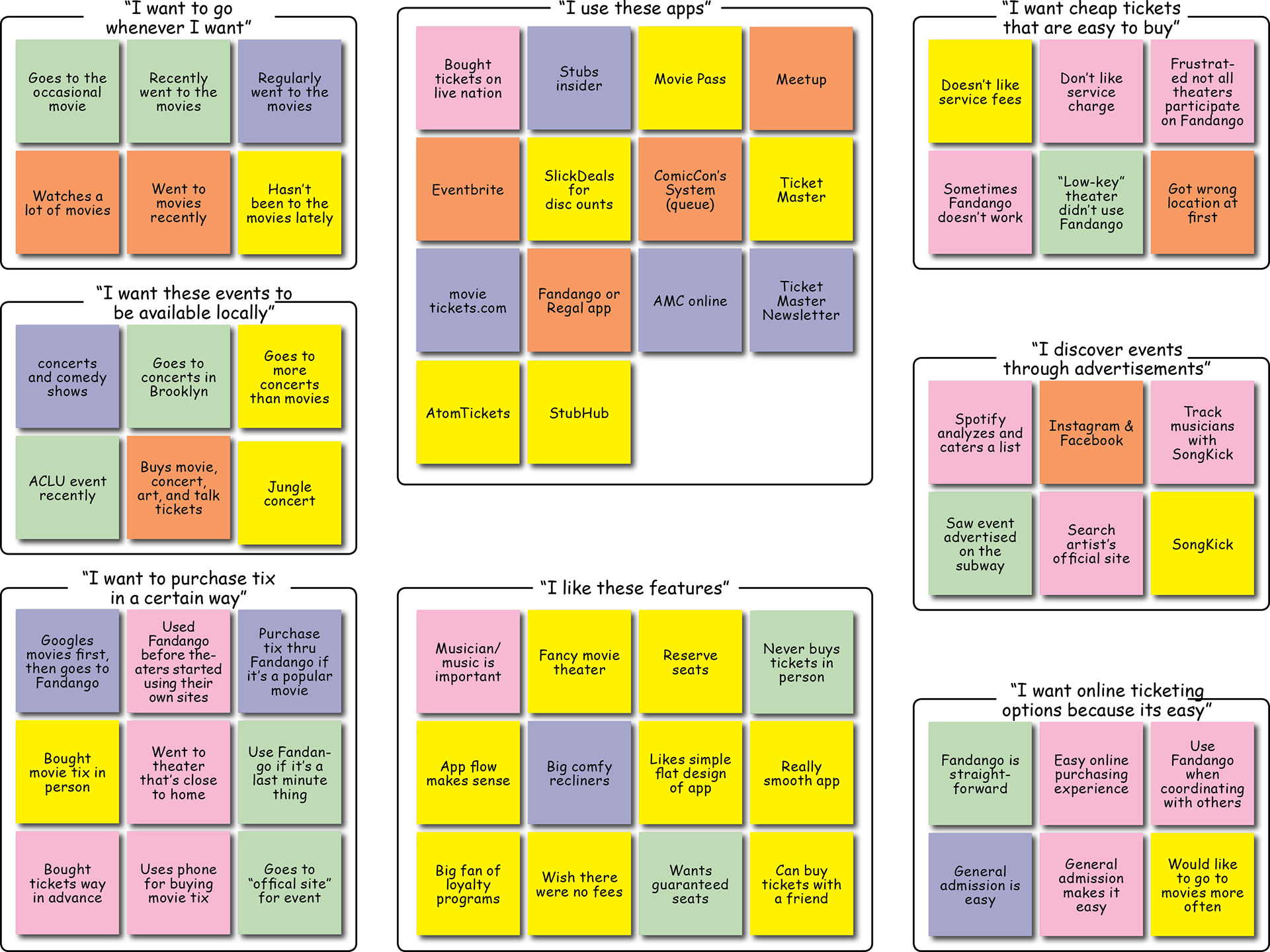
An affinity map of users responses from our user interviews
Synthesizing Insights from Interviews:
• Users use many different platforms to buy concert tickets
• Users have fewer platform options when it comes to movie tickets
• Users want to buy tickets online
• Users rely on their networks to hear about events
• Users want cheap tickets
• Users want a seamless online purchasing experience (good service, simple, easy to navigate platform, sleek design)
• Users want to attend events near them
• Users want choice when it comes to how they buy
• Users want to compare prices, times, and dates
• Users don’t like service fees (are willing to go out of their way to avoid)
• Users want to stay “hip” or up to date on movies and events that are culturally relevant
• Users rely on search engines (like Google) to be directed to different purchasing platforms
• Users rely on other apps that collect their data or activity to cater lists and suggest events for them
• Users wants loyalty programs that give them promotions or free gifts
• Users attend movies and events with other people
With those insights in mind, we created two personas. Our primary persona is Carlos, the Concert Goer; and our secondary is Maureen, the Movie Goer.
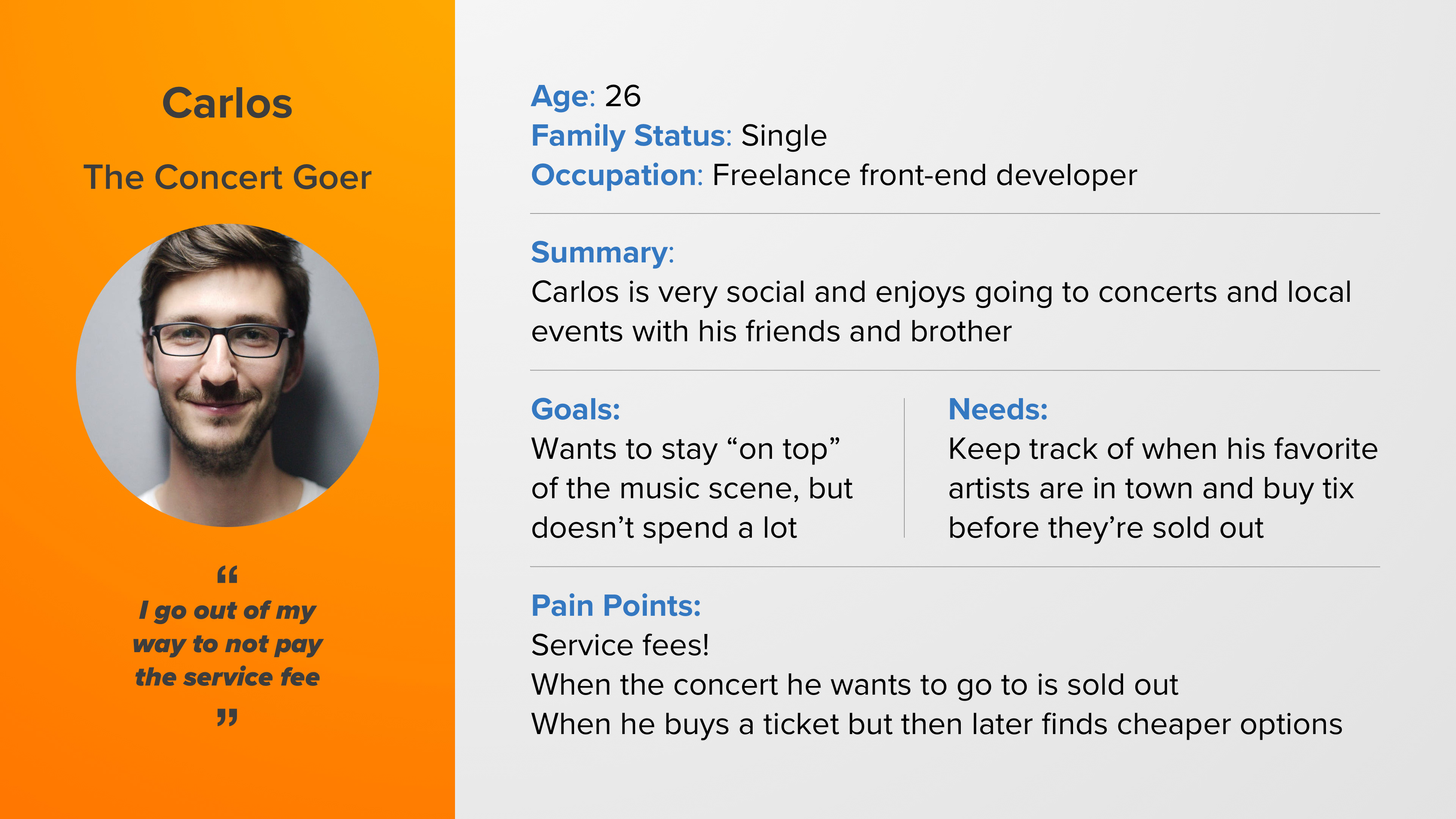
Our primary persona of Carlos, the Concert Goer
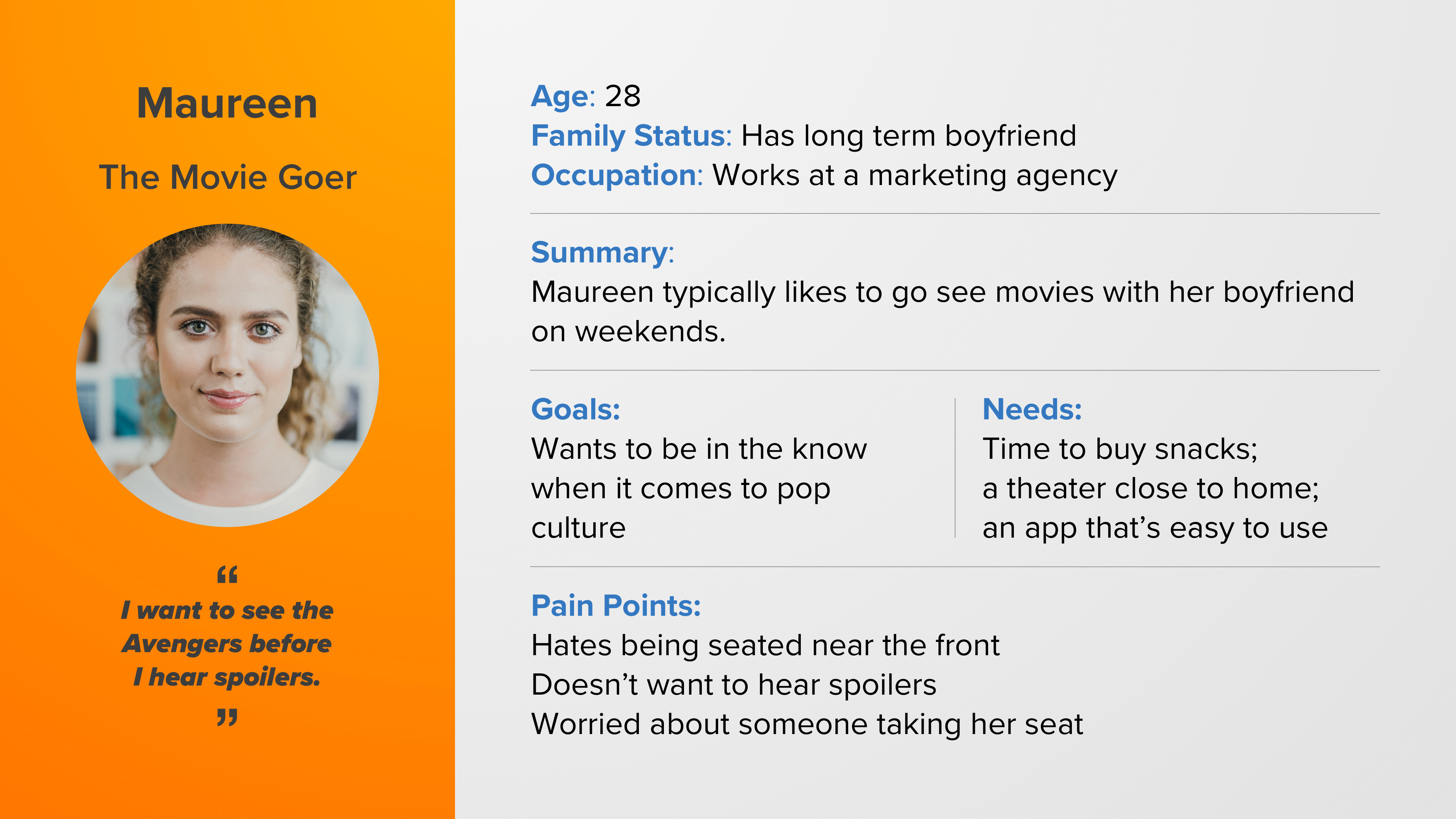
Our secondary persona of Maureen, the Movie Goer
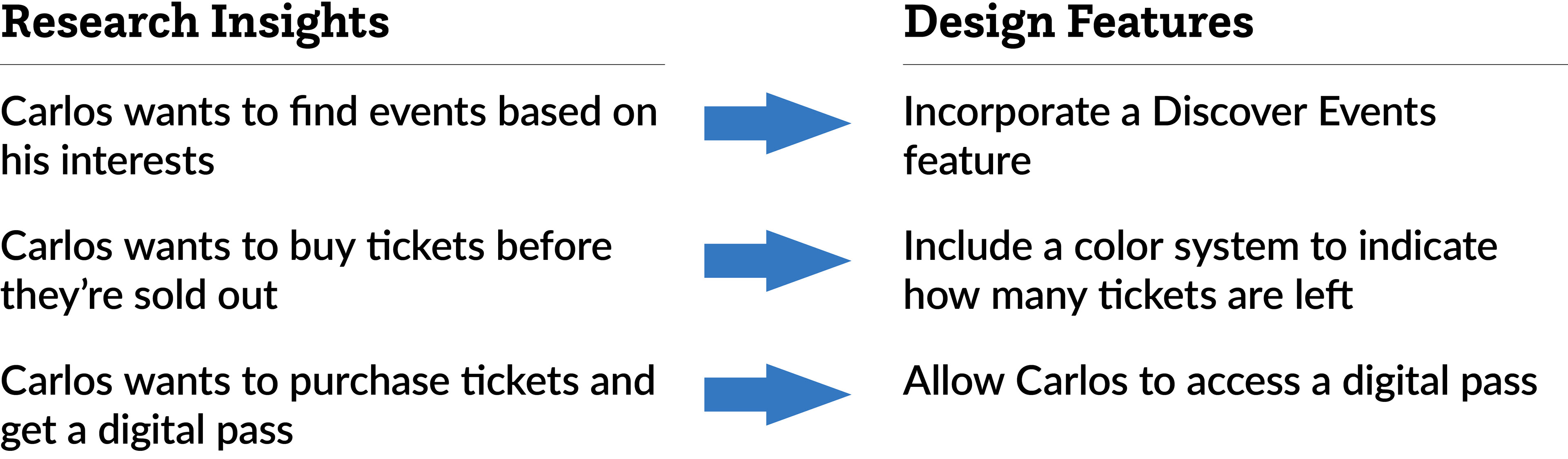
With those insights and personas in hand, we came up with the following features:
Now it was time for the design phase, which we kicked off with a design studio. Here's what we came up with in our design studio:
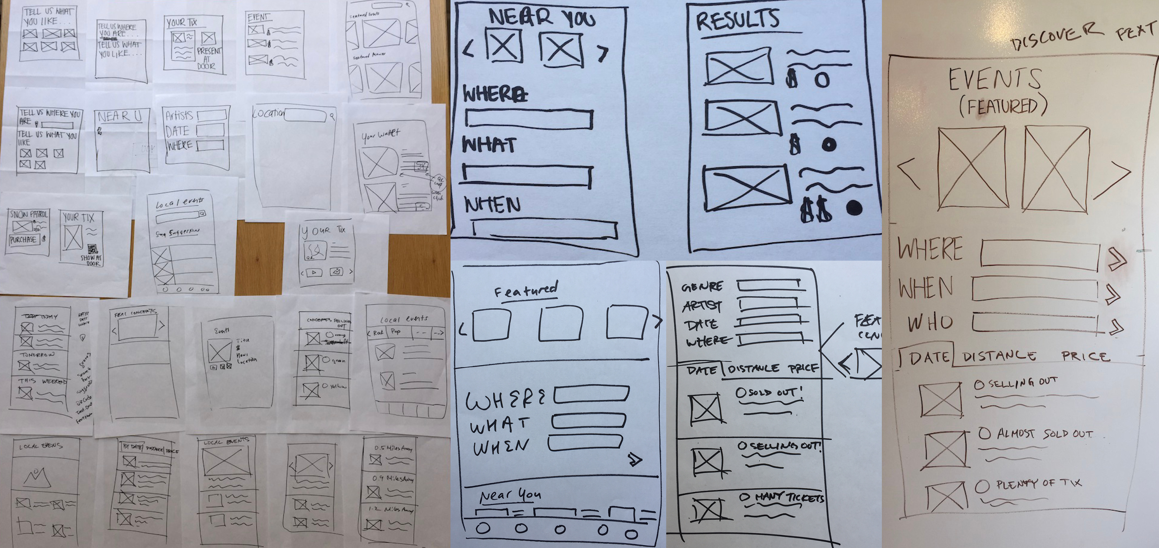
Some sketches from our design studio
With all those insights and possible features to include, we created a MoSCoW map and a Feature Prioritization map to help us decide which features to include and which to leave out for our MVP.
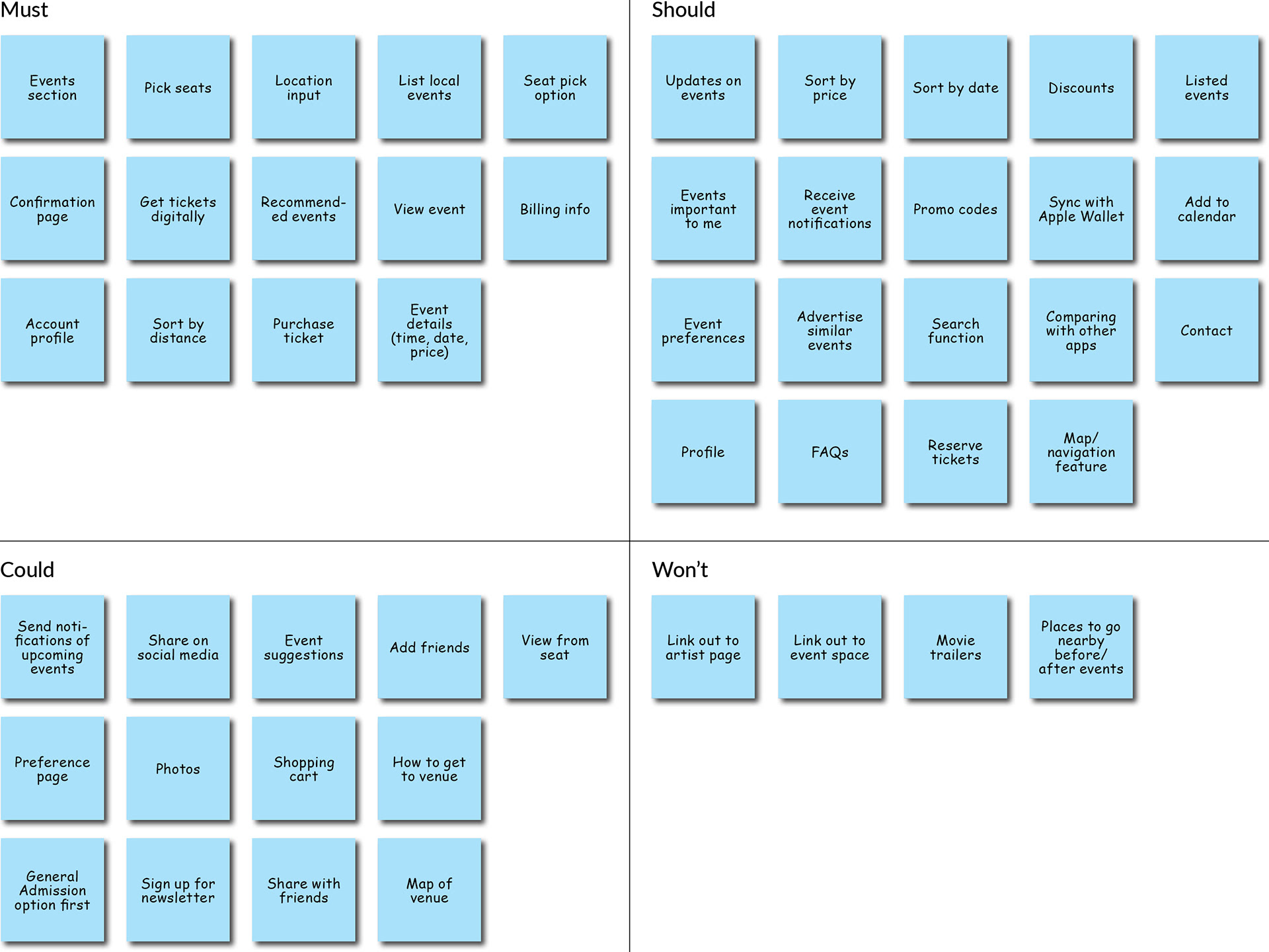
MoSCoW map for Fandango's feature integration
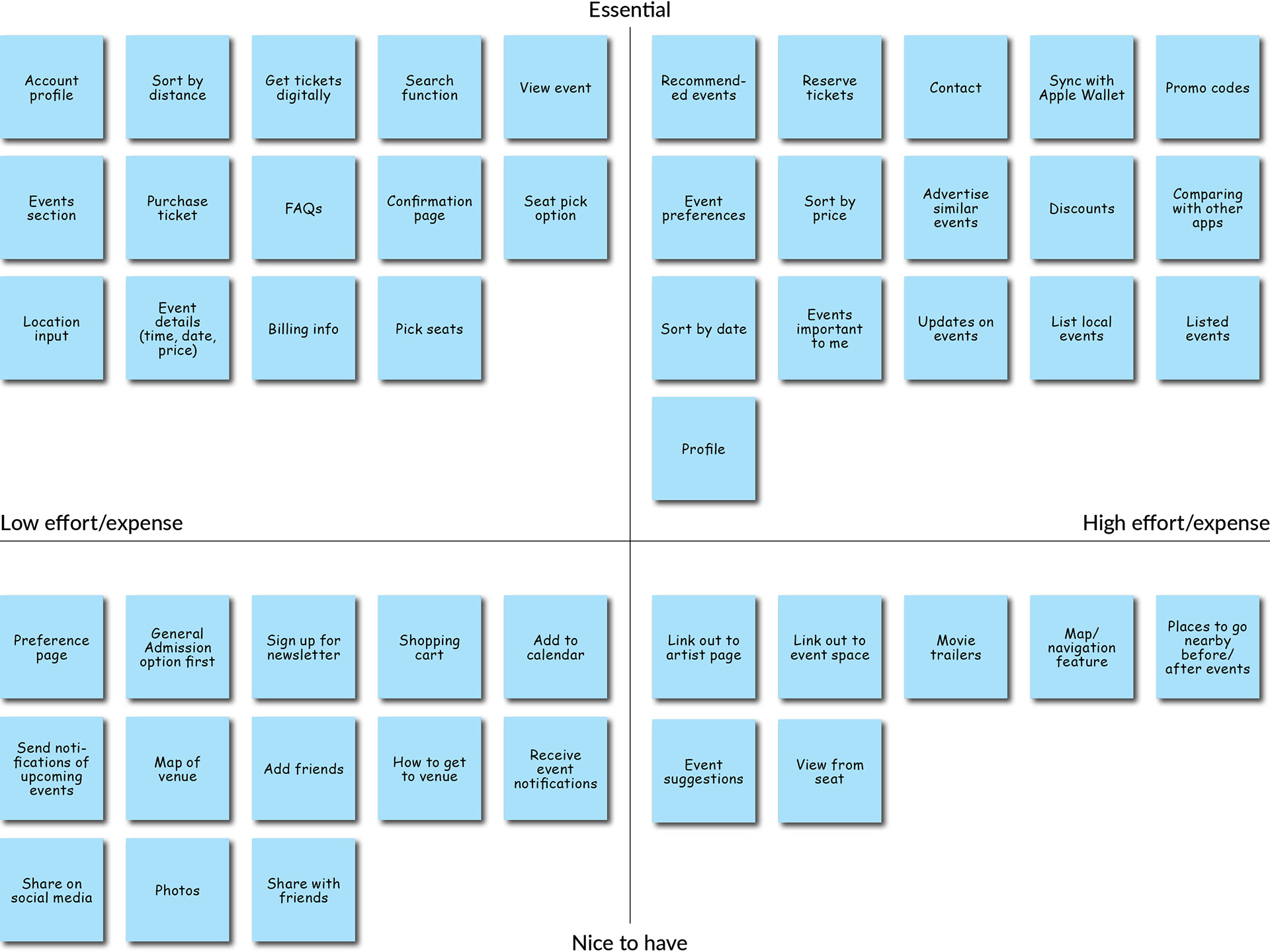
Feature Prioritization map for Fandango's feature integration
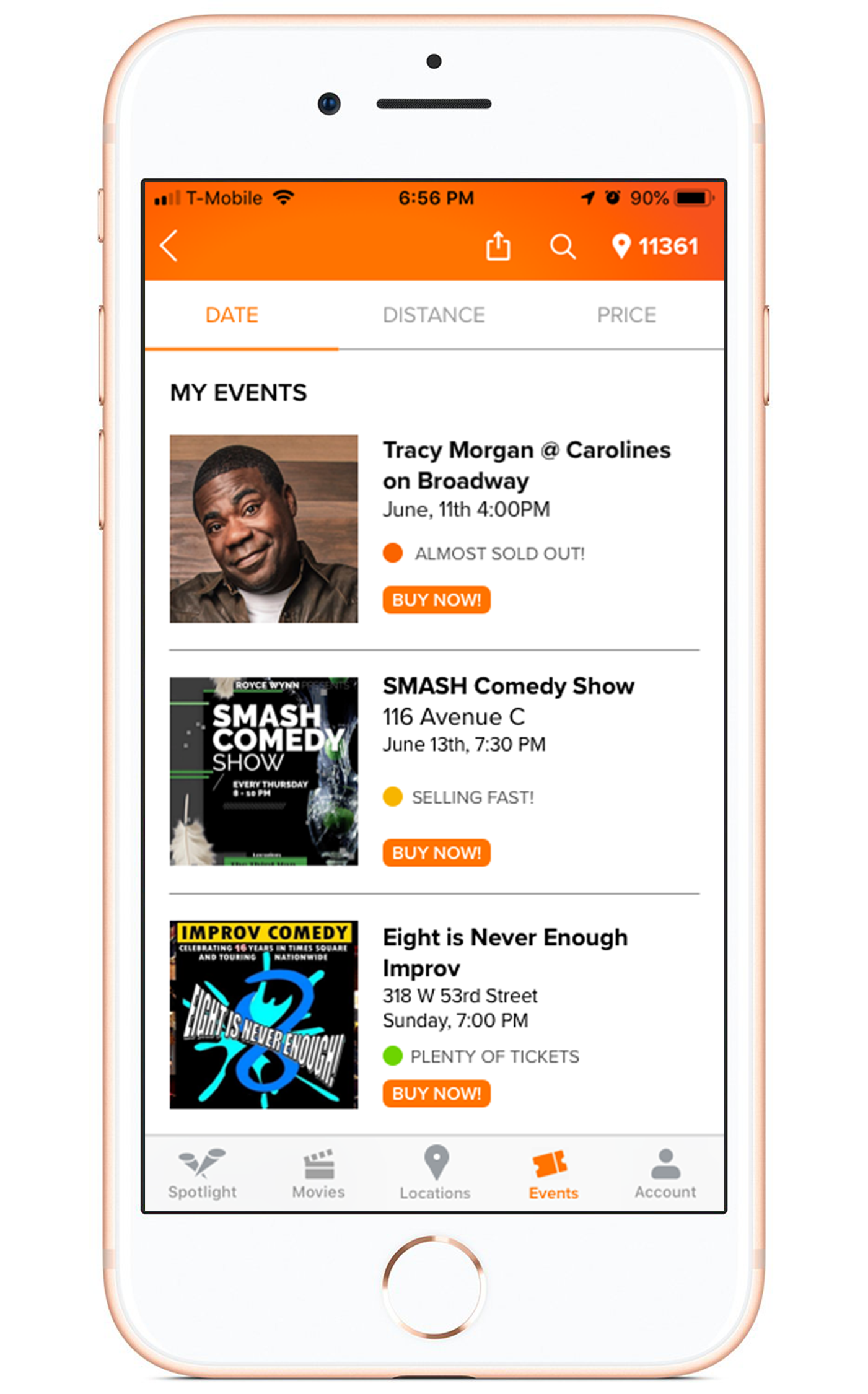
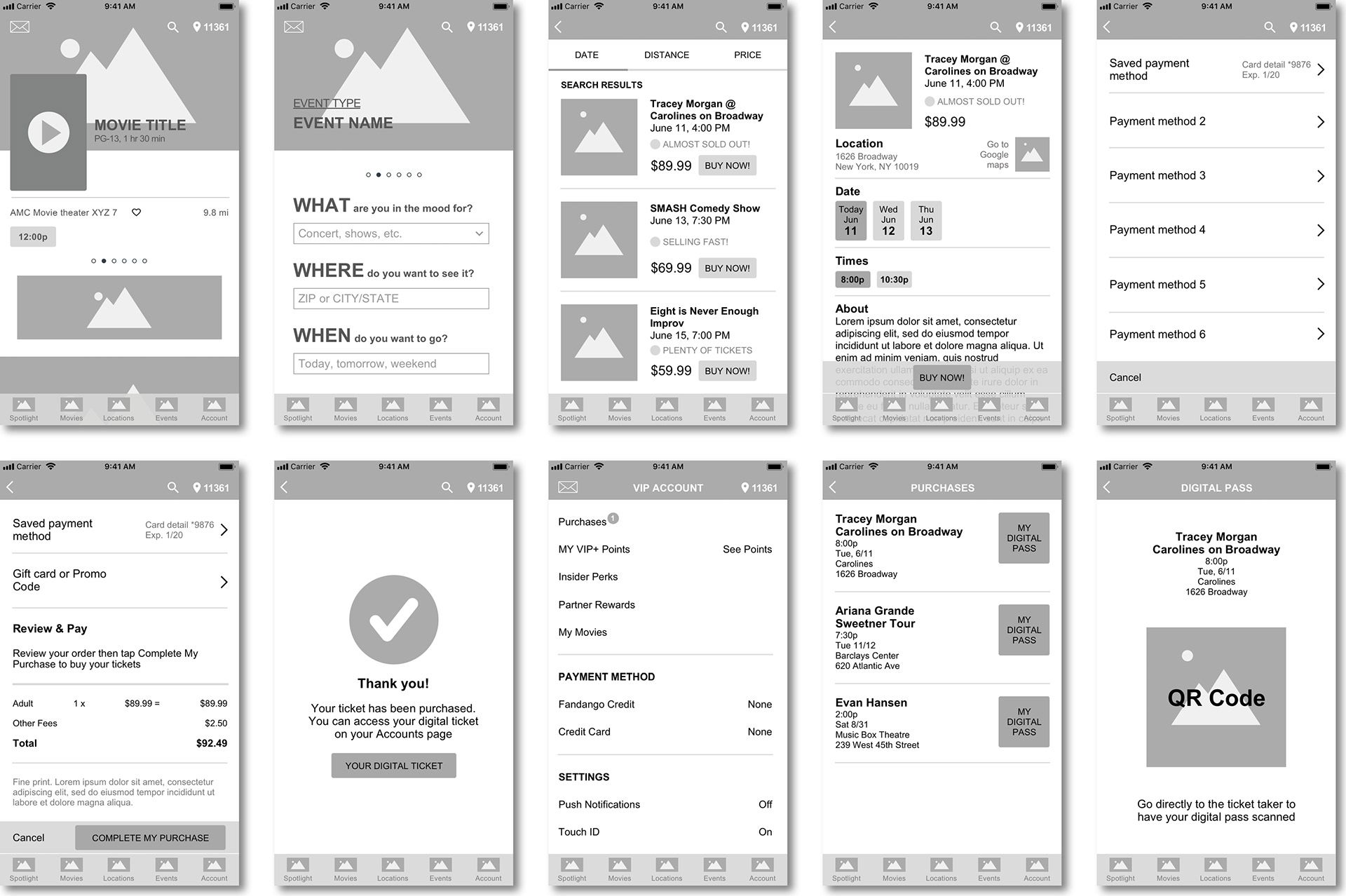
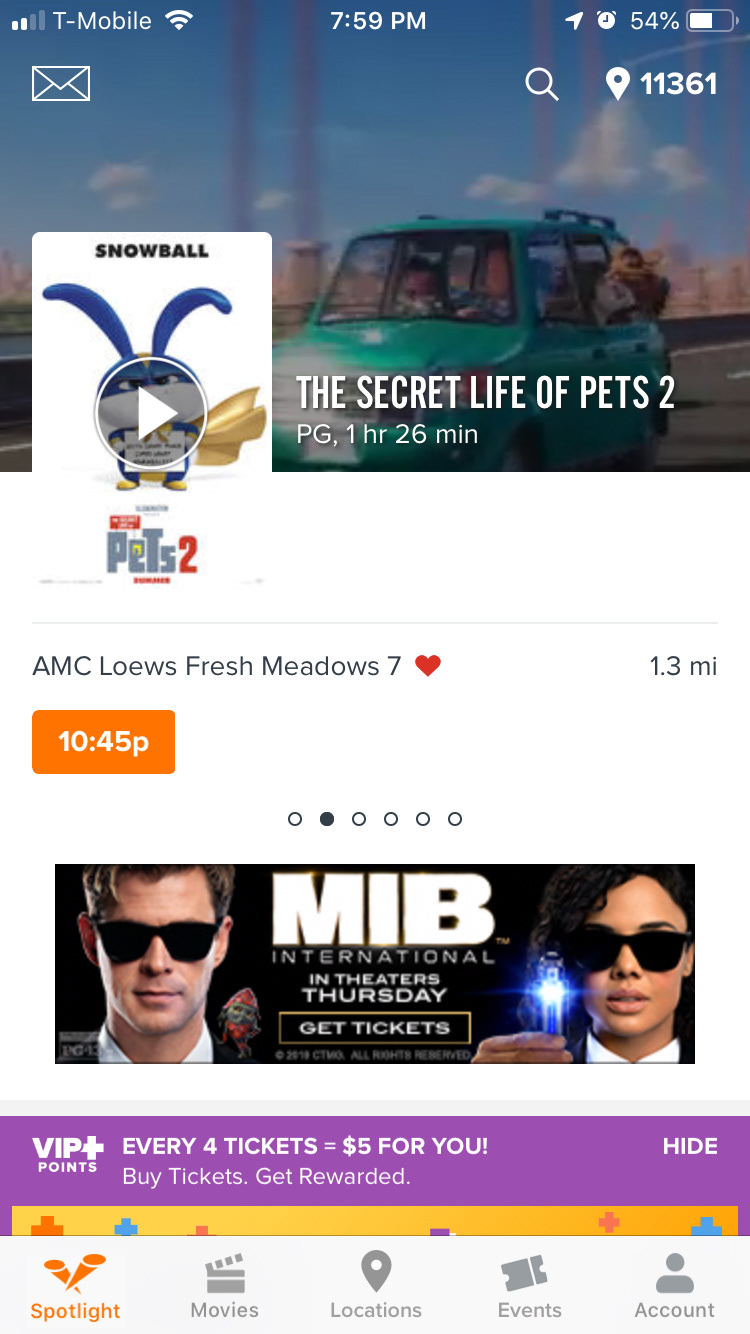
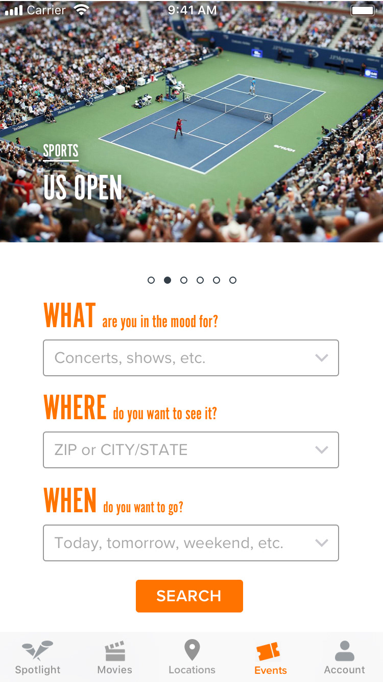
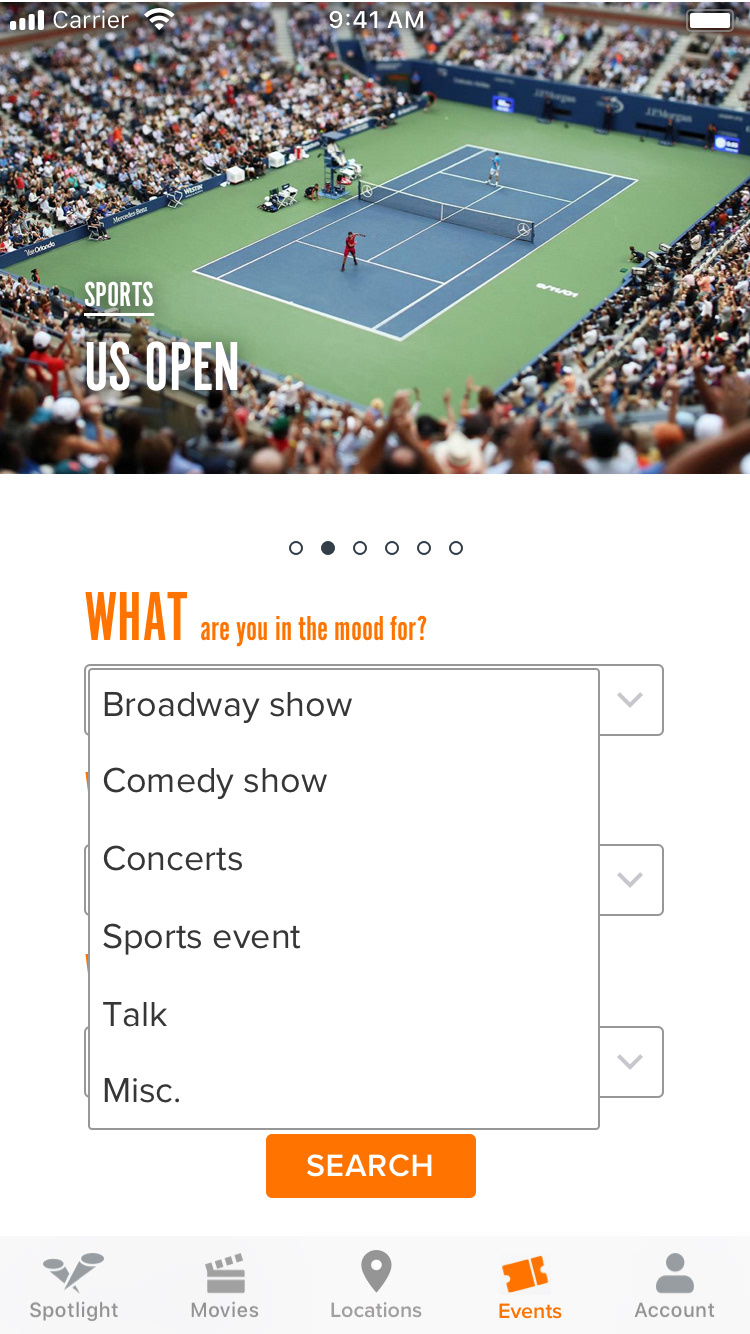
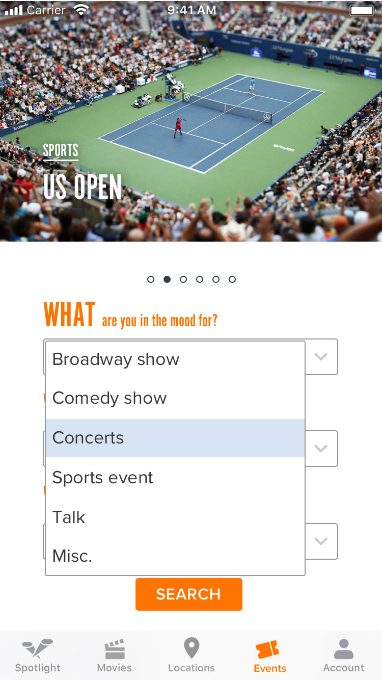
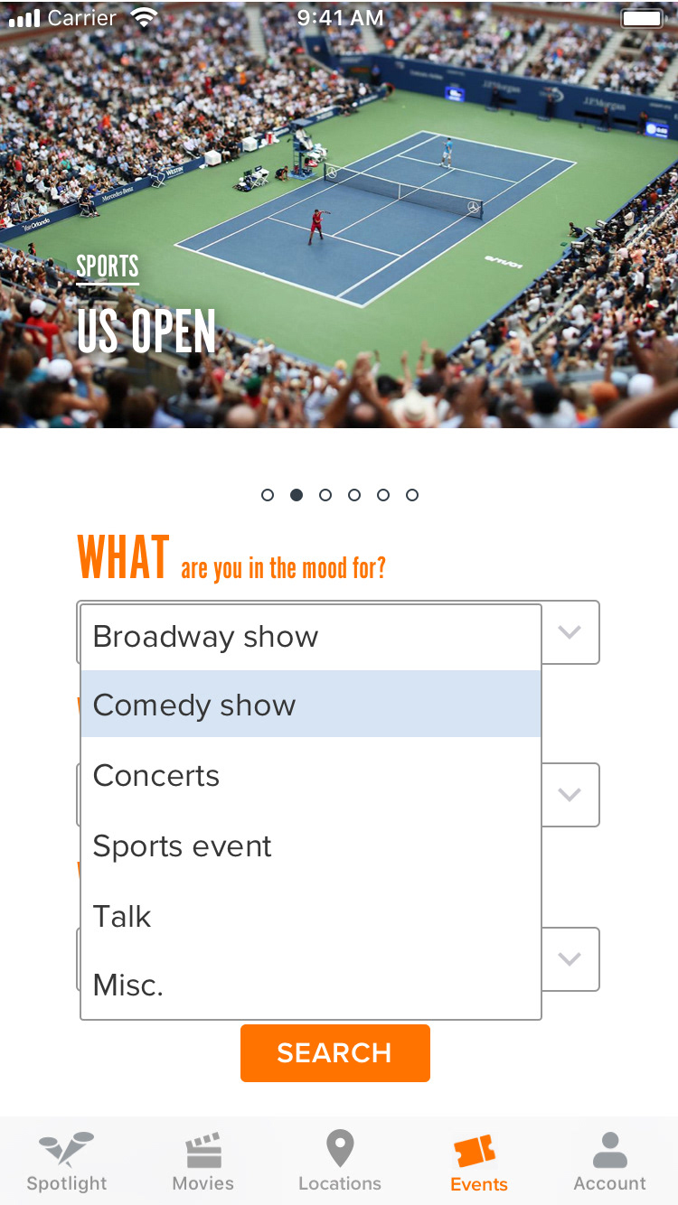
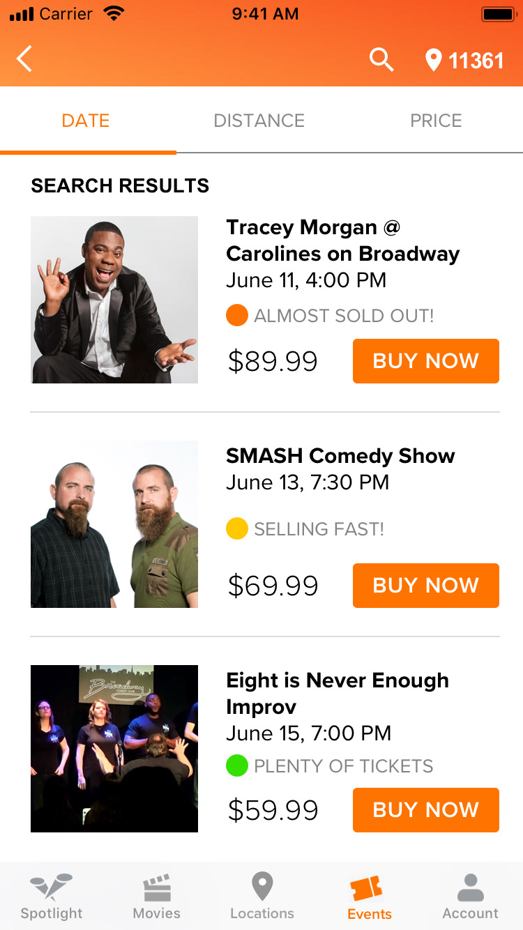
With Design Studio completed and our features decided on, we created mid-fi wireframes:
We prototyped these wireframes in inVision and conducted usability tests. Here are the results:
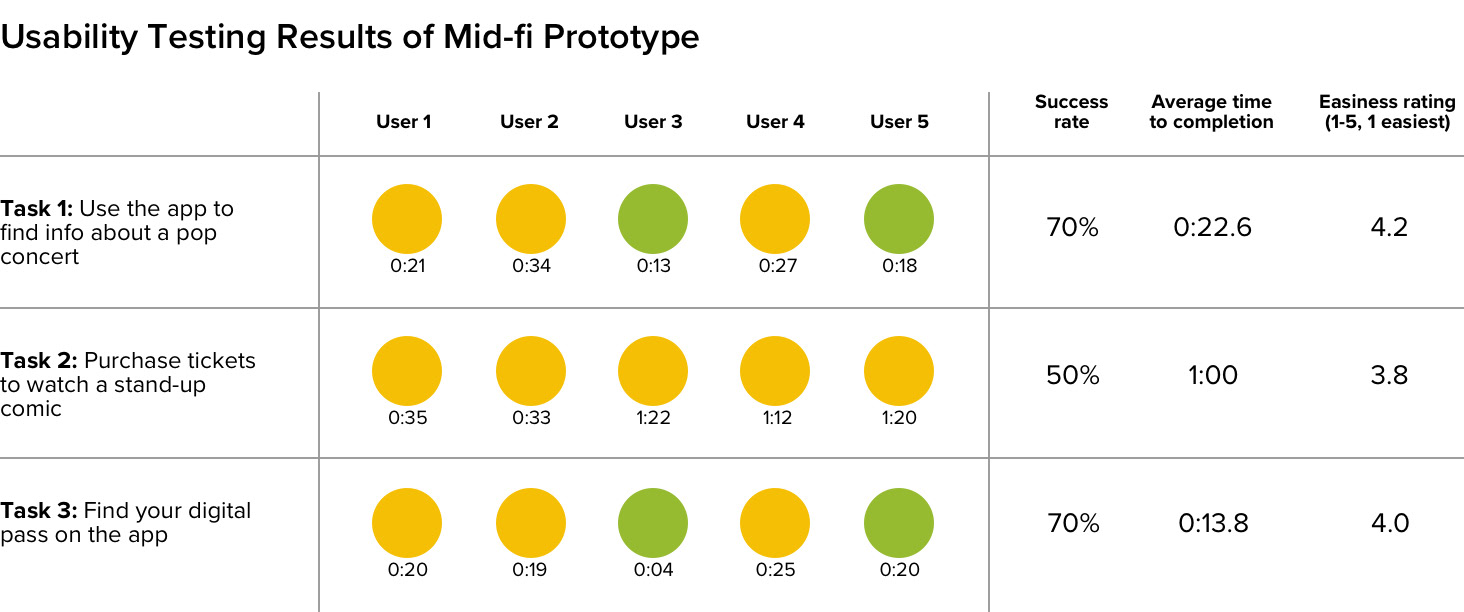
Key insights
• There was some confusion on how to search for events on the "Events" page
• Users wanted to be able to purchase right from the listings page
• Users had trouble finding their digital pass. They thought "My Purchases," were a non-clickable category like "Payment Method" and "Settings"
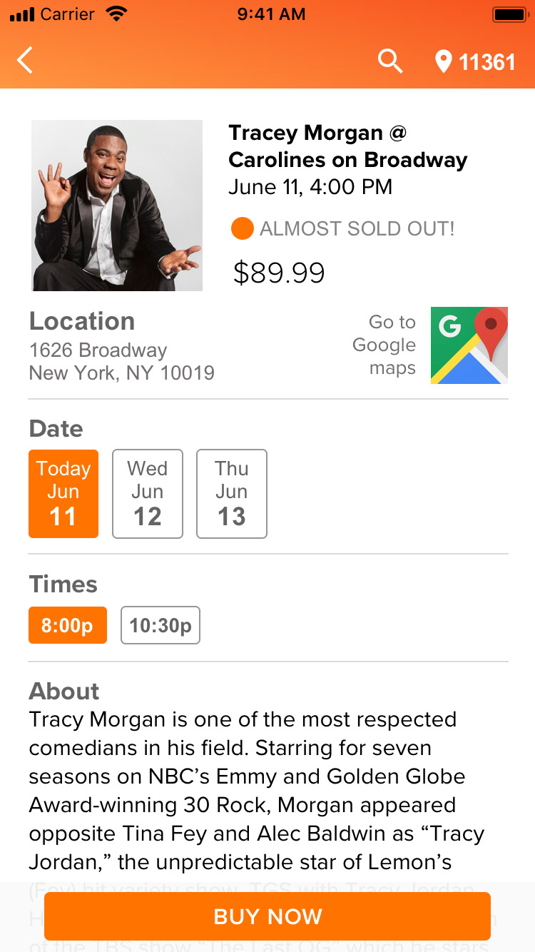
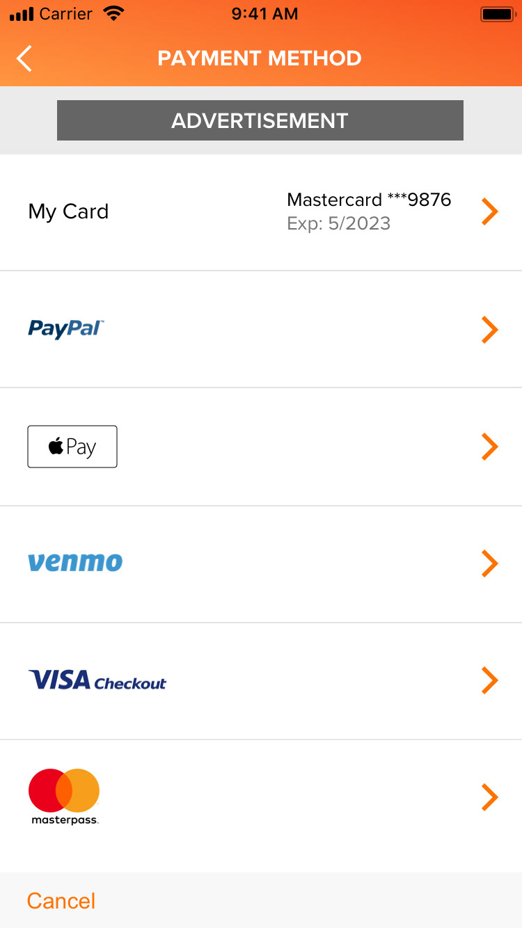
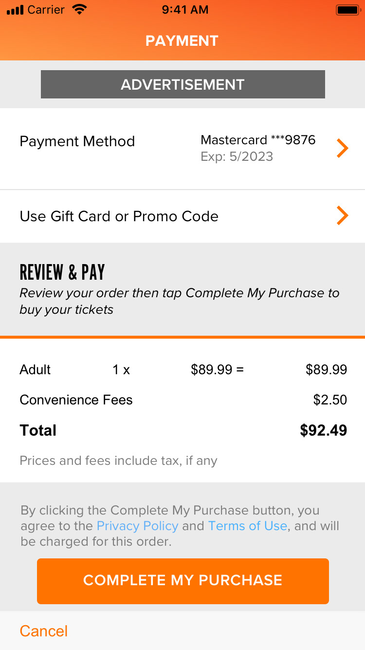
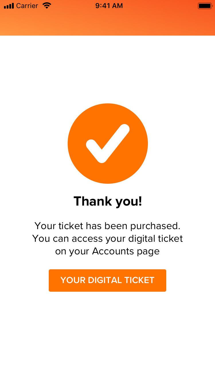
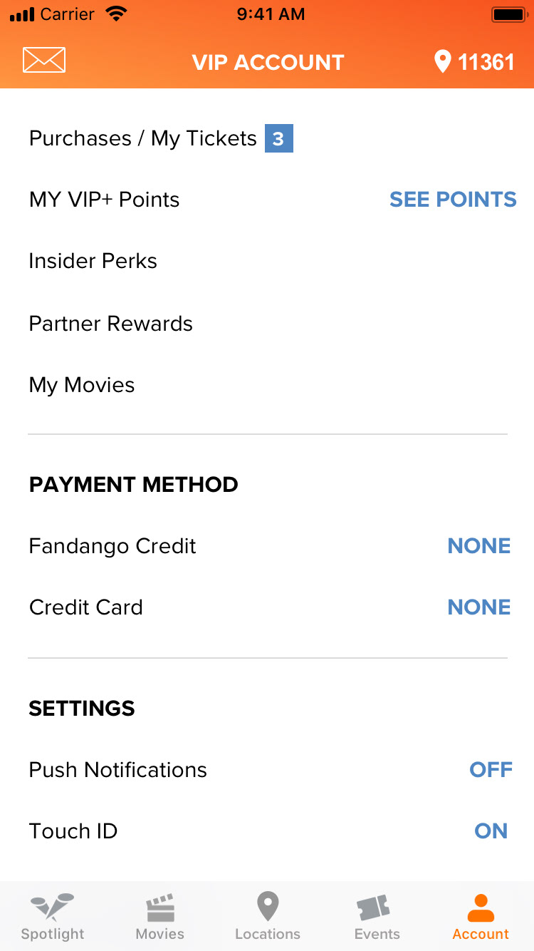
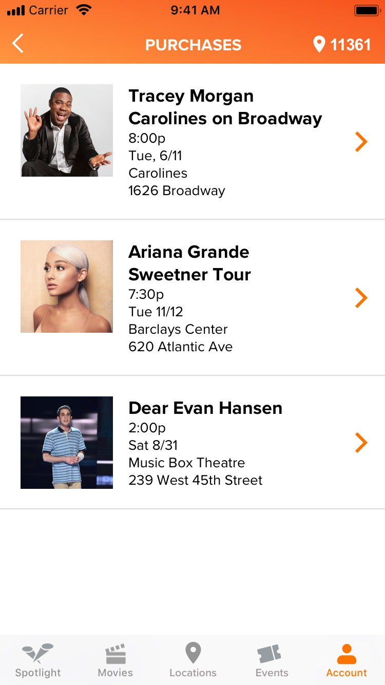
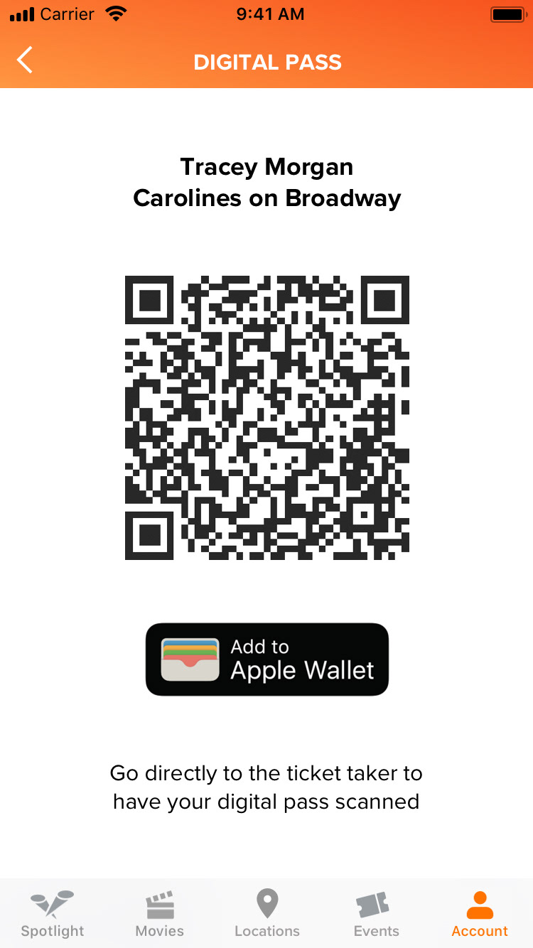
We kept those insights in mind when we worked on our next iteration. Below are our high-fidelity mockups:

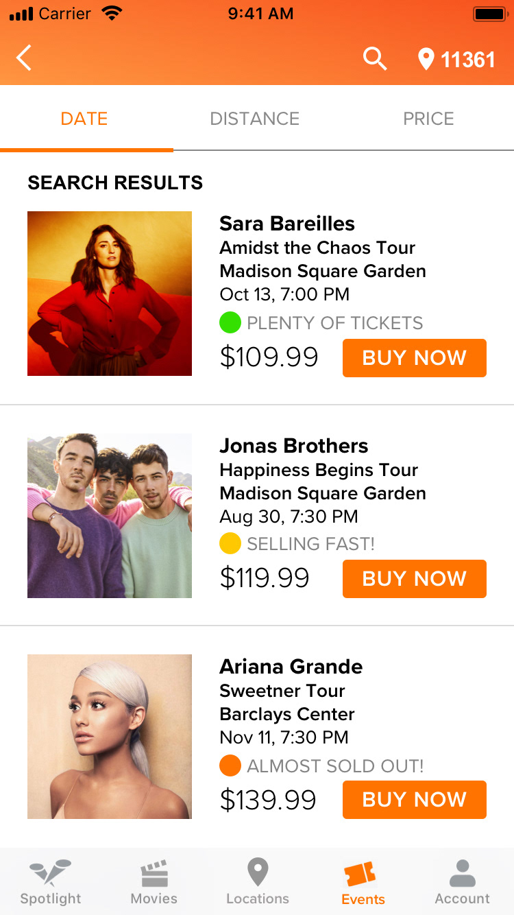
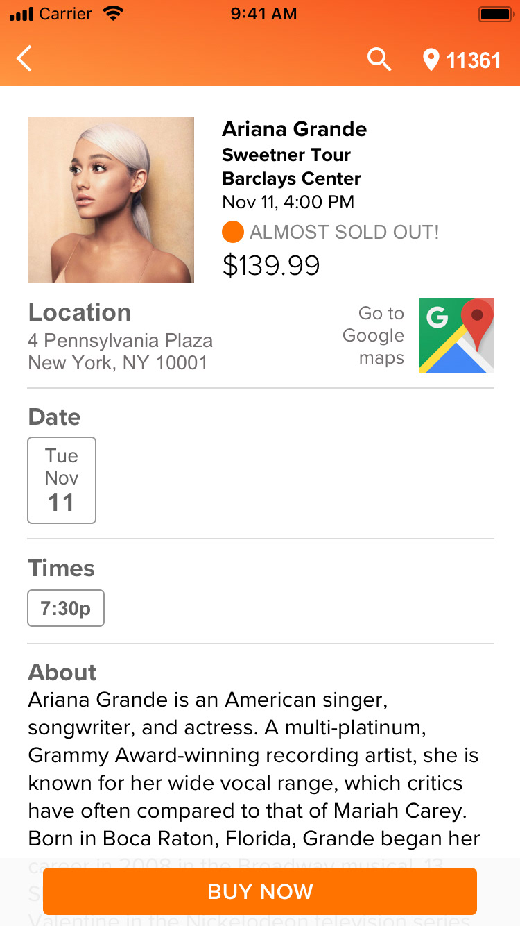

We prototyped these in inVision and tested it on five users. Below are the results:
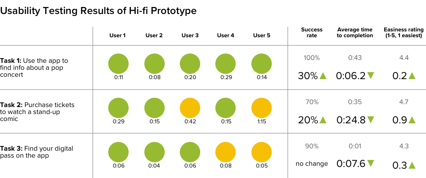
As you can see, there was significant improvement from the first usability test, however, there were still opportunities to improve on task two and three.
Key Insights
• Users found the descriptions on the "Events" page very clear, but was confused as to whether all three fields needed to be filled before being able to search
• Users would like to see some sort of progress bar during the payment process
• Users did not like seeing an advertisement during the payment process
• While most users took a direct path to finding their digital pass, to a couple of users, it wasn't completely obvious that it belonged under the "Accounts" menu
Next steps
Based on the insights from our second usability test, I propose:
• Iterating the "Events" page by changing the CTA after a single field is filled
• Incorporating some sort of progress indicator during the payment process
• Adding and testing a notifications number by the "Accounts" button on the bottom navigation