case study

Brooklyn Brainery

The CLIENT
Brooklyn Brainery
Our team was tasked with redesigning Brooklyn Brainery’s website. Brooklyn Brainery is ‘accessible, community-driven, crowdsourced education.’ They host casual classes for adults on a myriad of topics ranging from the History of the Revolutionary War to making dumplings to watercoloring to managing your money. And all the courses are dreamed up by their users and/or teachers. Brooklyn Brainery charges a small fee to offset the logistics -- providing the space, taking care of sign ups, marketing, and materials. The classes are on nights & weekends; for adults 18 and over; are usually 1-3 sessions, with each session lasting one and a half to three hours; and costing anywhere from $10 - $60.
My Role
UX Consultant
I consulted on various aspects in the research, functionality, and visual design. I delivered mid-fidelity mockups for testing, while also conducting product & user research, usability testing to validate design decisions, and delivering design iterations after synthesizing user feedback.
The problem

Brooklyn Brainery's site has many classes without a filter or sort them. They are listed solely by date making it difficult and time consuming for someone to find a class they are looking for.
Problem statement
How might we…
Help a lifelong learner, integrate into a community of fellow learners with a wide range of interests and expertise?
Research

We were given an archetype — the ‘lifelong learner.’ Our lifelong learner is someone who wants to take classes and learn new things, and is interested in both general and private classes. 

To kick off our research we started off with a screener survey where we screened for people who took short recreational classes outside of academia and signed up for them through a website. 
A screenshot of our screener survey where we screened for users who took short recreational classes outside of academia
Once we found our testers, we conducted a usability test of the existing website. We asked for their initial thoughts of the site; we had them complete some tasks; and we asked them for their final impressions. We observed the users navigate through the site to see if they took direct or indirect paths to completion, and the time it took them to complete it. Here are the results:

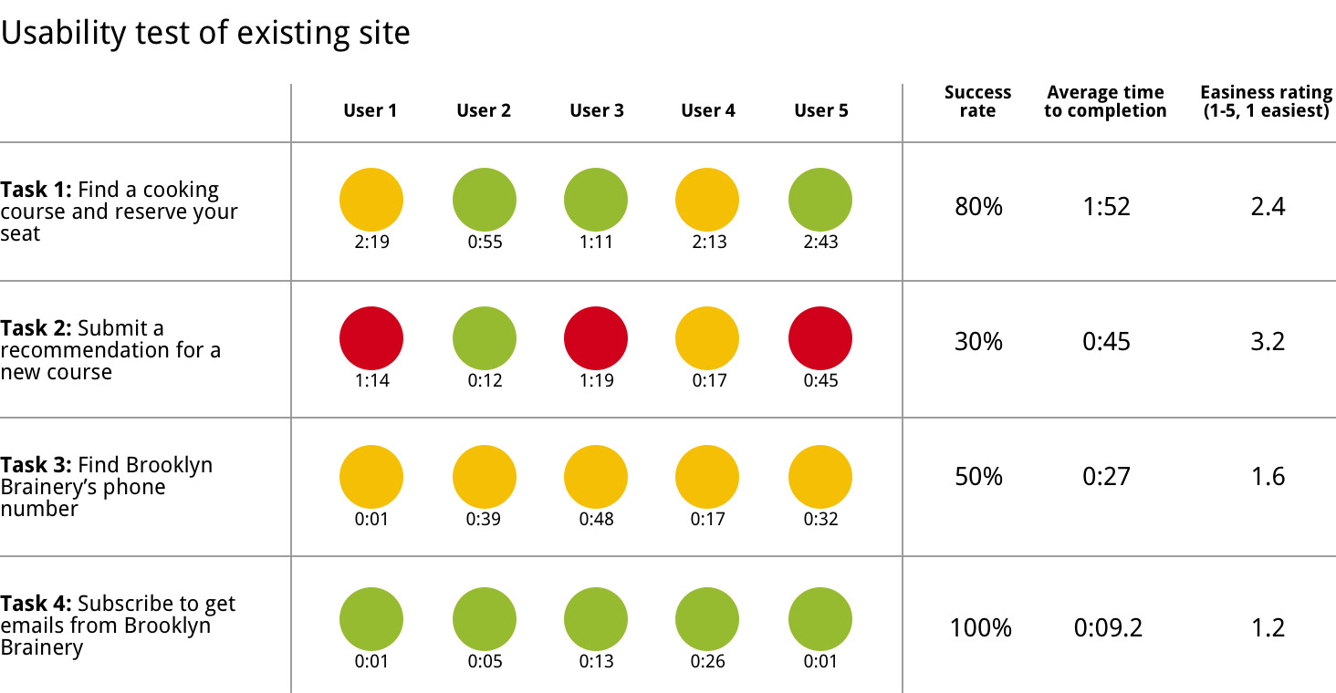
Results from usability test of Brooklyn Brainery's existing site

Next we filled out a business model canvas to help us understand the values, activities, and customer relationships that Brooklyn Brainery provides. And of course, how they make money.
We then created a competitive matrix. This allowed us to take a step back and take a wider view of Brooklyn Brainery's business.

Competitive matrix of Brooklyn Brainery with their competitors

This gave way to identifying Brooklyn Brainery’s competitors and comparators. With those companies in mind, we conducted both a competitive feature analysis and a comparative feature analysis. For the feature analyses, we took ten features from competitors and comparators and compared them to Brooklyn Brainery.

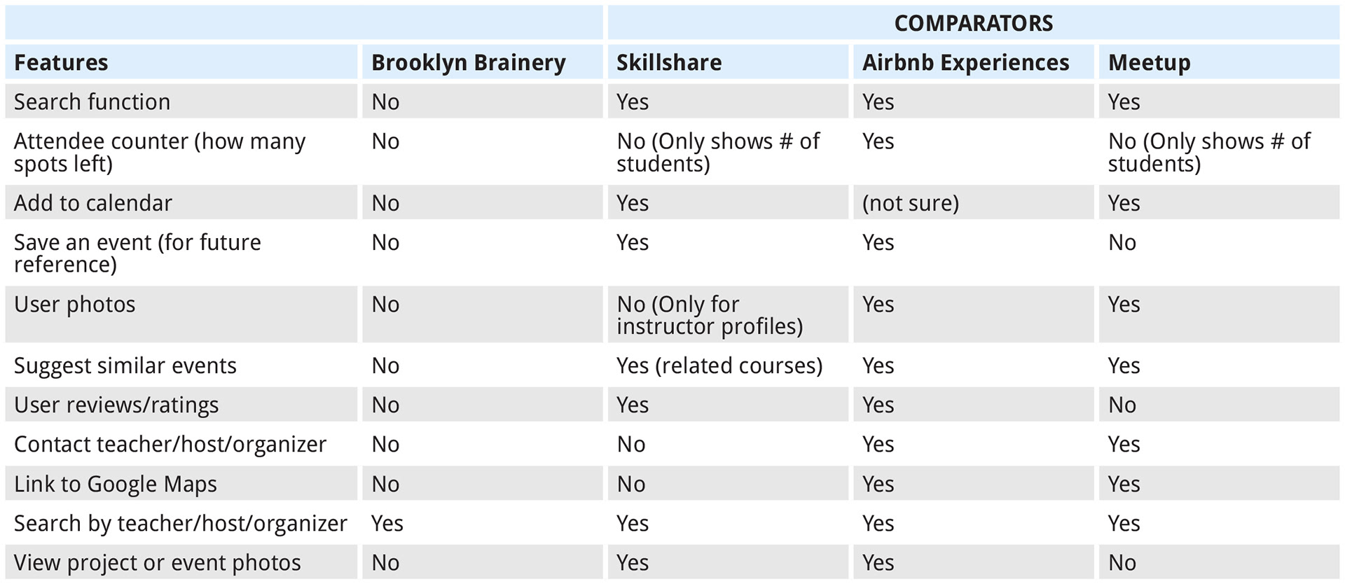
A feature analysis of Brooklyn Brainery and their competitors

A feature analysis of companies that follow a similar business model

Card Sort
We gathered content and nav items from the website for card sorting. We split this activity into two: one card sort for all the classes; and one card sort for the nav. We did an open round of card sorting with five people. Here are the results:

Open card sort of navigation items

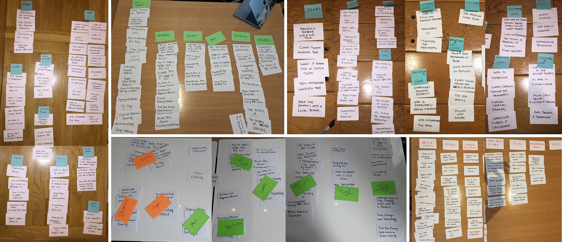
Open card sort of courses offered

That concluded my team research and I started working alone with a heuristic evaluation of the existing site. I implemented the Abby Covert method of heuristics on five of Brooklyn Brainery's site. Below are the results:

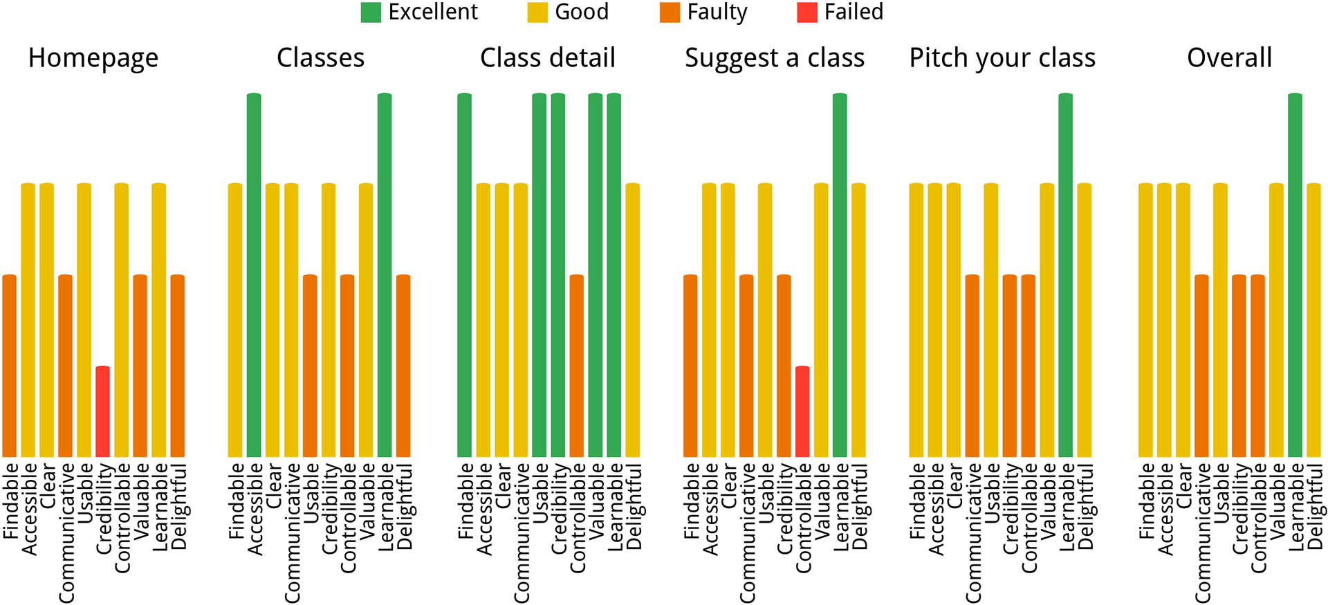
A heuristic evaluation of five Brooklyn Brainery's pages

Next came the mobile view audit where I looked at the same five pages I did for heuristics and compared them to their mobile view counterparts. I noted the differences between the two screens and any recommended changes that should be implemented.

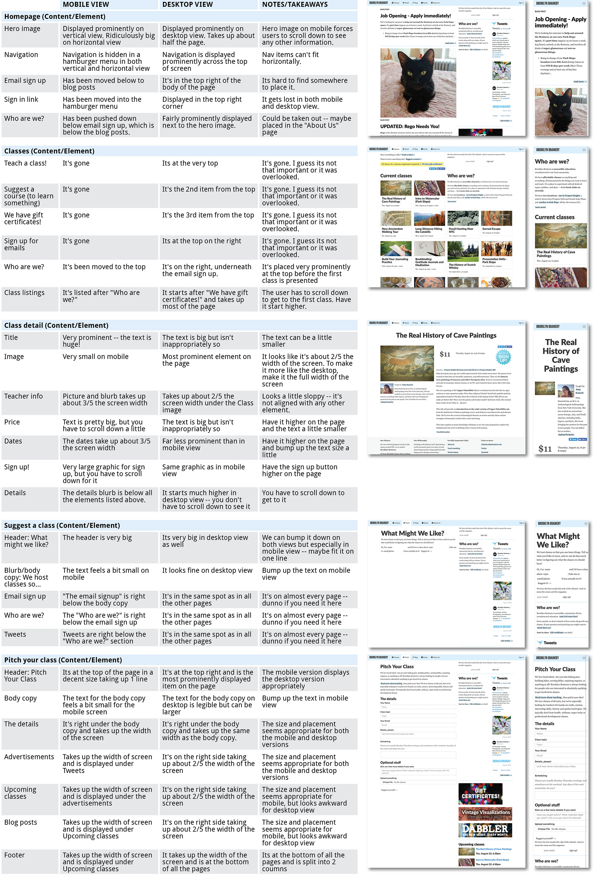
A mobile audit of five of Brooklyn Brainery's website

I then created a sitemap for the existing website to help me visualize the information architecture of the site.
And lastly, I created a user flow. I created a flow to visualize how a user would flow through the site to sign up for a class and/or suggest a class.
Key Insights
• There was a lot of confusion regarding suggesting a course to learn something and pitching a class to teach something.
• The large number of classes was overwhelming to sift through without being able to sort or filter them. 
• The credibility of the site took a hit with the promotional items prominently displayed over several parts of the site. 
• There’s no sense of place when navigating through the site.
• A lot of the forms users were asked to fill out were not very well controlled. The forms allowed for errors to be input. 
• The navigation has a redundant element — the homepage and the blog page are the same. 
• Signing up for emails needs to be more descriptive — users weren’t sure what exactly they were signing up for.
• The sign in feature doesn’t change anything.
• Some of the links take you away from the site instead of opening in a new tab.
• The free/cheap events are over a year old.
With those insights in mind, I came up with a proposed site map and user flow. Below are the proposed changes to the information architecture of Brooklyn Brainery's site:

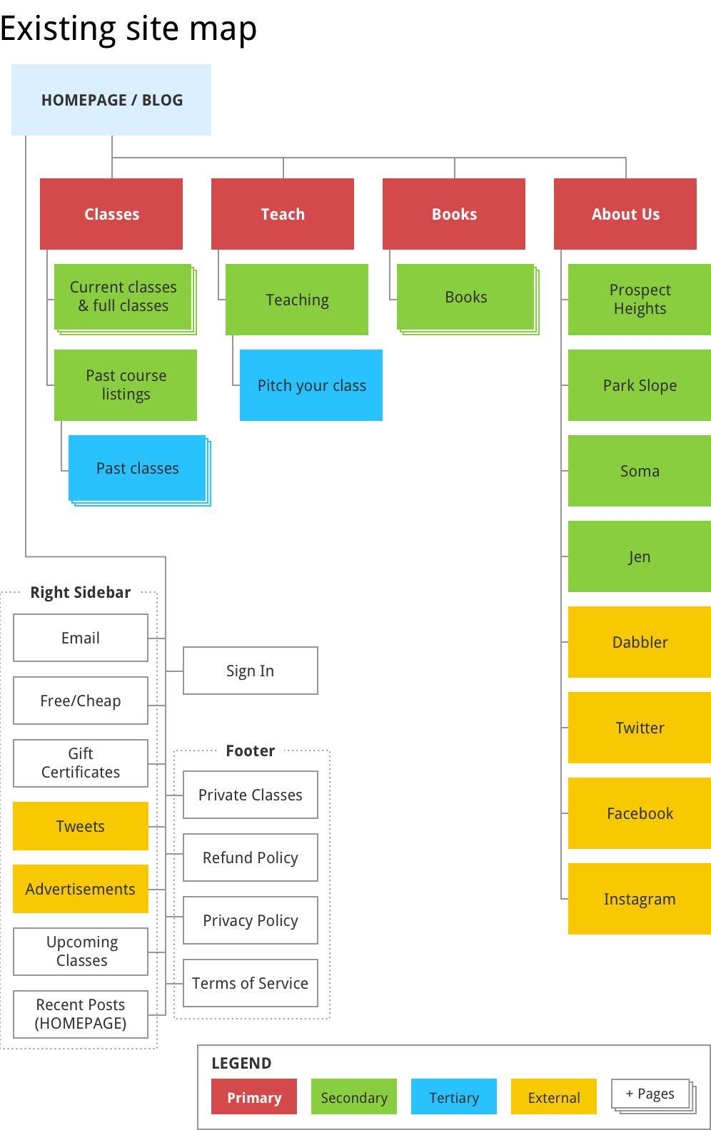
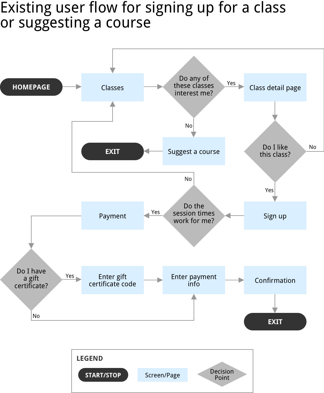
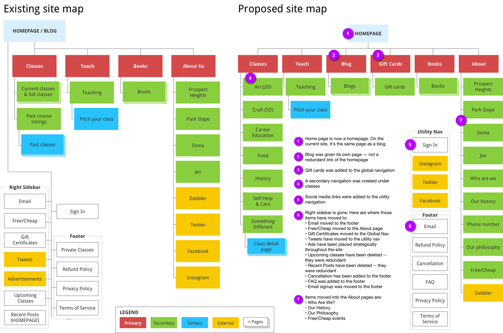
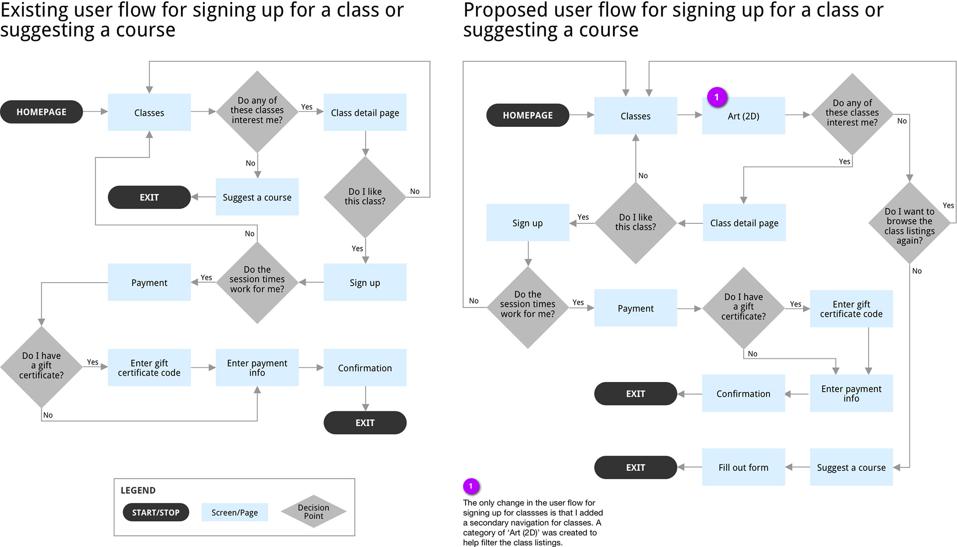
Existing and proposed site maps for Brooklyn Brainery's website

With the proposed site map and user flow in mind, I performed two closed card sorts. For the nav, the categories were: Classes, Teach, Blog, Books, and About Us. For classes they were: Art 2D; Crafts 3D, Career Education; Food; History; Self Help & Care; and Something Different. Here are the results:

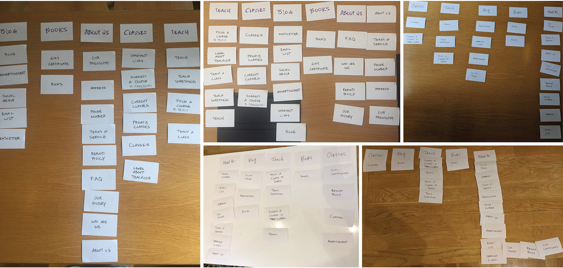
Closed card sort of the navigation items

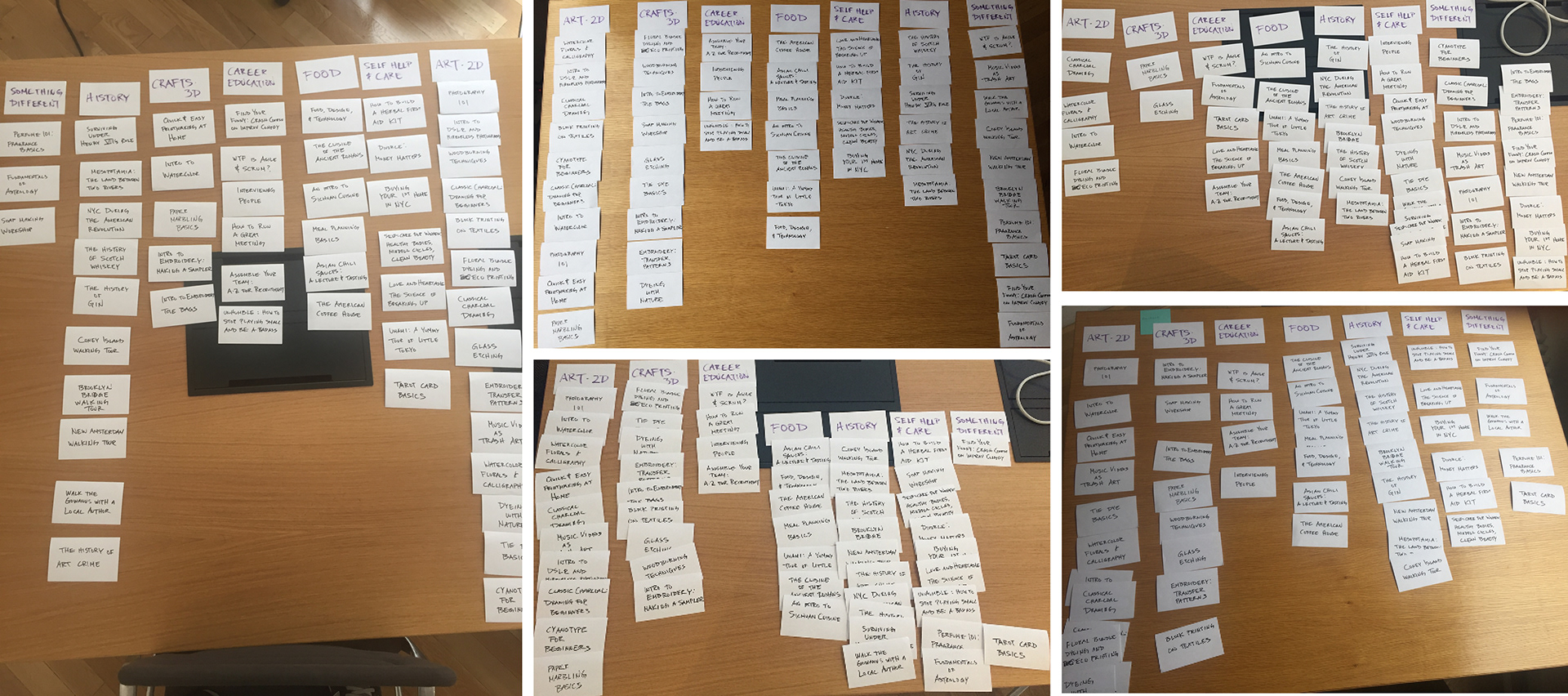
Closed card sort of the courses offered

With the closed card sort done and the proposed information architecture decided, it was onto executing those design decisions. Below are the screens for the existing site with the proposed mid-fidelity wireframes below them.

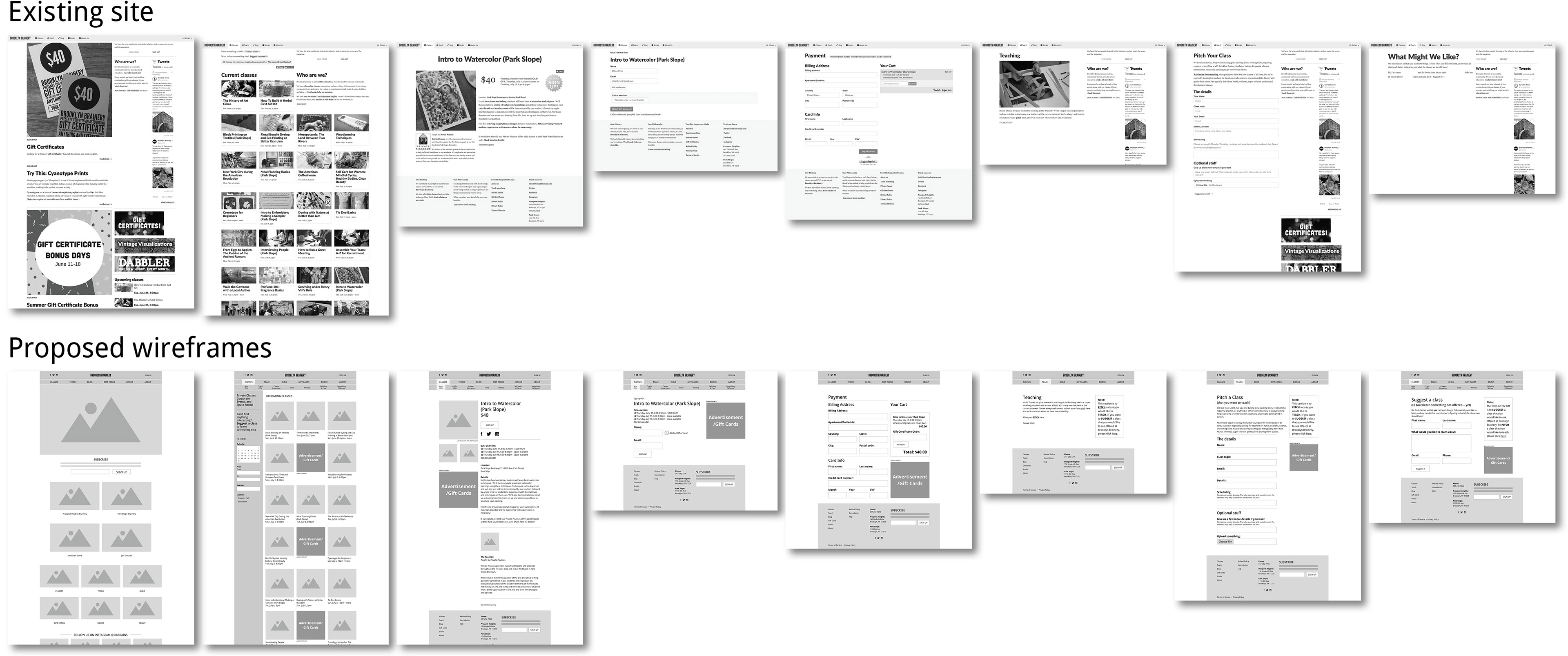
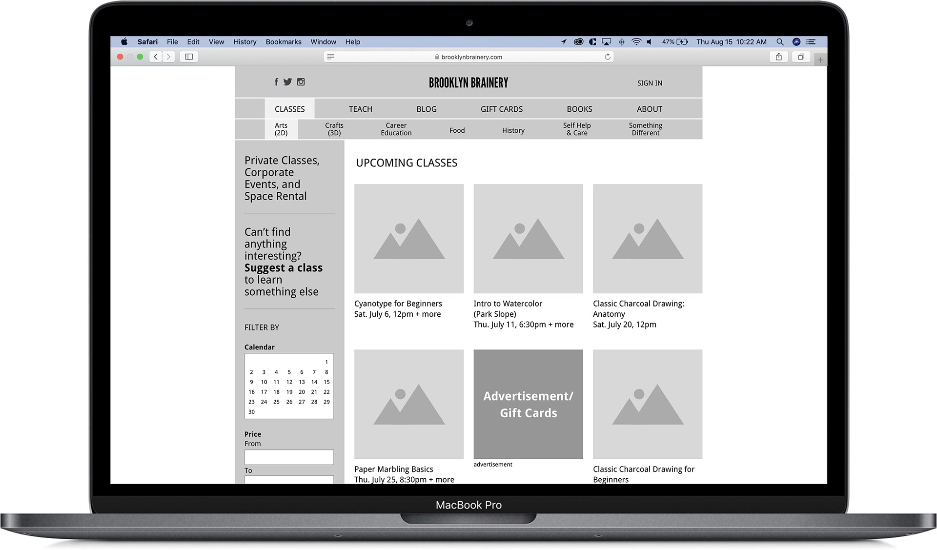
Top: screens of the existing site. Bottom: mid-fidelity wireframes of a proposed redesign

I prototyped those wireframes in inVision and conducted a usability test. Below are the results along with the changes from the usability test from the existing site.

Results from a usability test of the mid-fidelity prototype of Brooklyn Brainery's website redesign

Next steps
Based on the usability test, you can see there was marked improvement. There was opportunity for improvement (there always is). For next steps, I propose:
• Create a high-fidelity prototype filling in the site with appropriate images, color and language
• Redo the secondary navigation to make it more noticeable
• Explore different solutions to differentiate between “Suggest a course” and “Pitch a class”