The CLIENT
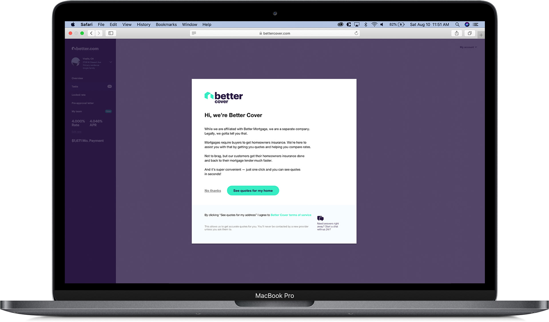
Better Cover
Better Cover is a home insurance company. Their product currently exists entirely in a modal for Better.com customers. Better.com is a home mortgage company that provides mortgages without a traditional network of brick & mortar offices, but through 24/7 technology and on-demand human assistance.
My Role
UX Consultant
I consulted on various aspects in the research, functionality, and visual design. I delivered high-fidelity mockups for testing, while also conducting product & user research, usability testing to validate design decisions, and delivering design iterations after synthesizing user feedback.
The problem
Better Cover brought our team on to increase the opt-in rate (look at insurance quotes) and conversion rate (purchase an insurance policy).
80%
Opt-in rate
35%
Conversion rate
Research
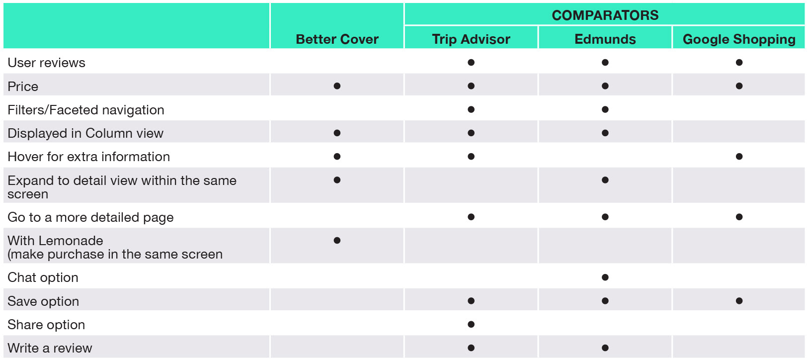
We started off by researching our client, their competitors, and the home insurance industry. We interviewed our client to give us a better idea of how Better Cover operates, and what specifically they wanted us to accomplish. To get a better sense of Better Cover, we created a Competitive Matrix, Business Model Canvas, and did a Feature Analysis.
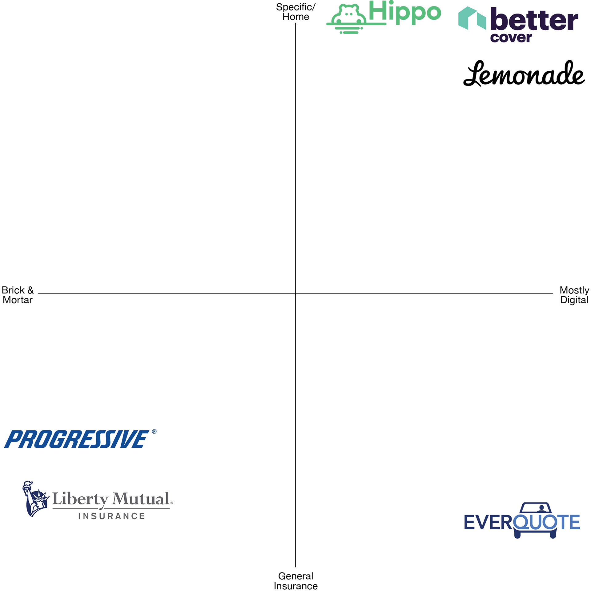
A competitive matrix of BetterCover with their competitors
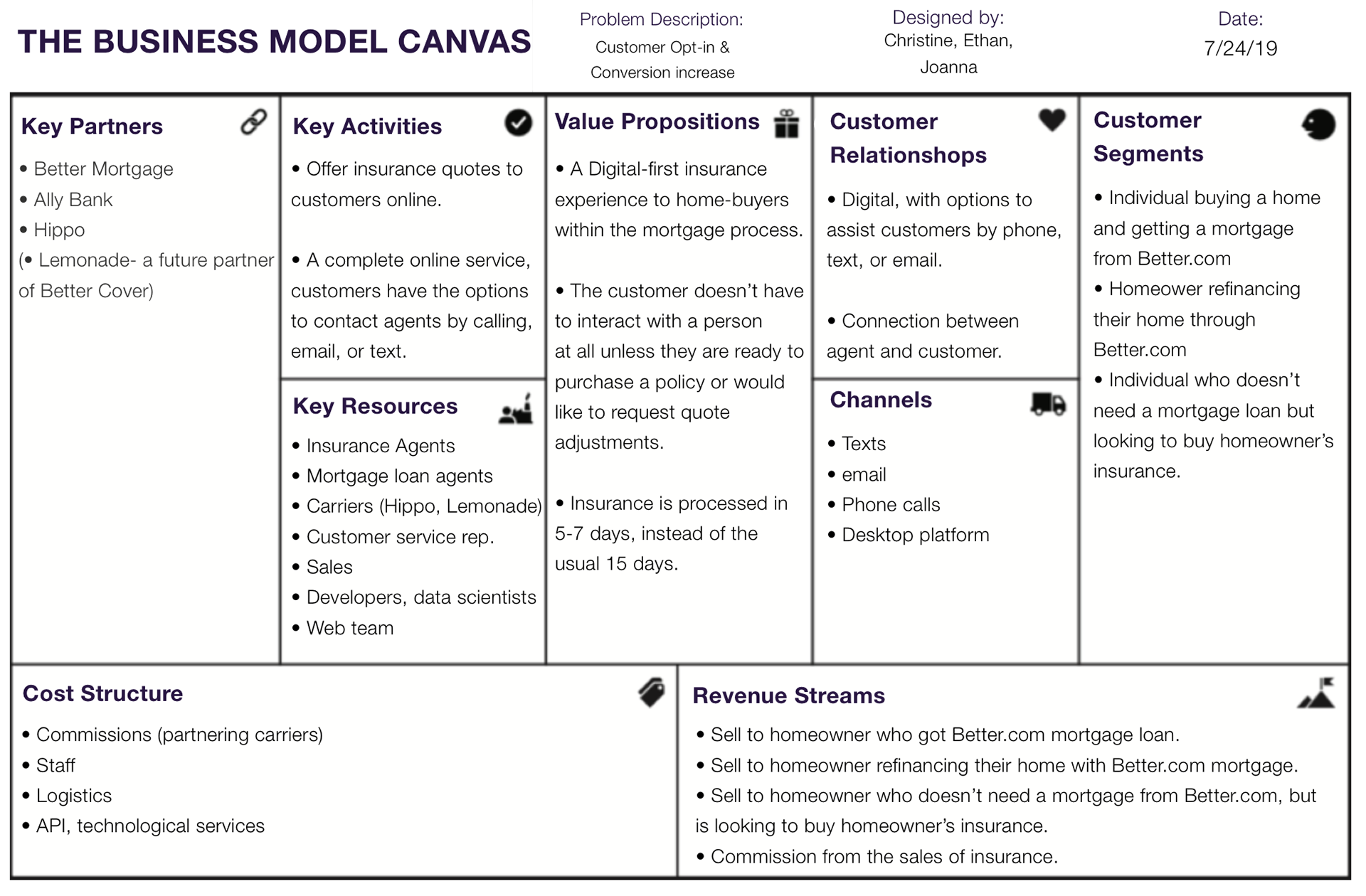
Business model canvas of Better Cover
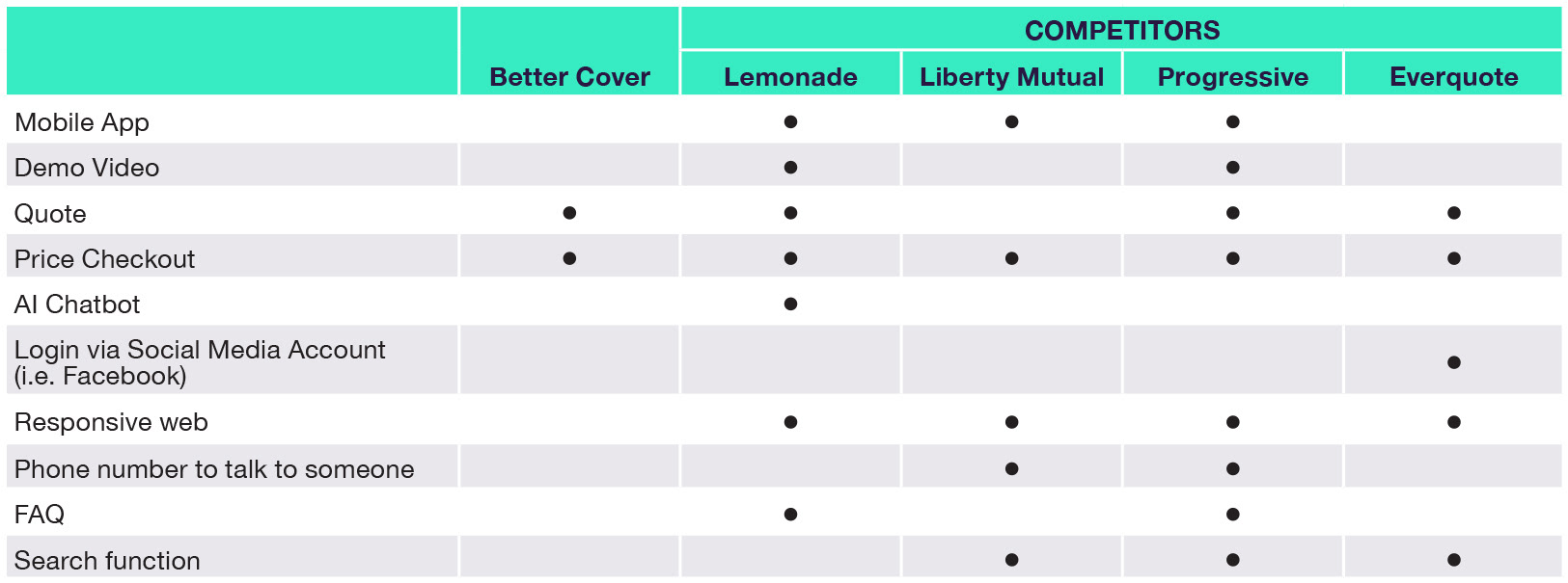
The above table compares the features of Better Cover with it’s competitors
The above table compares the features of Better Cover with other sites that compare different products/services
We created a screener survey to find users to interview. We screened for people who purchased home insurance.
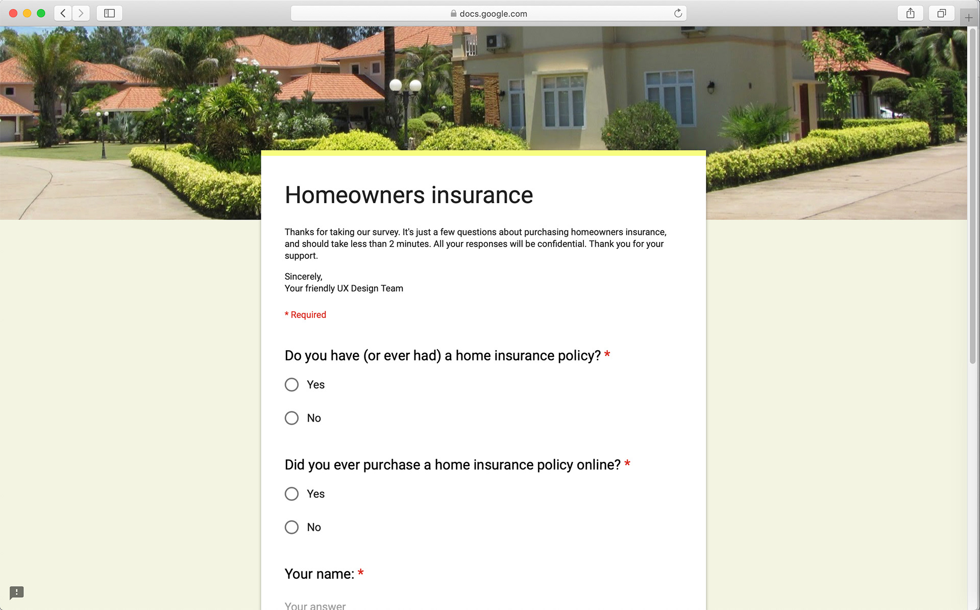
A screenshot of our screener survey
Once we found our five home insurance purchasers, we conducted our interviews. We asked them to walk us through the purchasing process; what their pain points were; what kind of information they wanted to see; and what sort of concerns they had. After we recorded their responses, we created an affinity map to look for patterns or any type of similar groupings/responses.
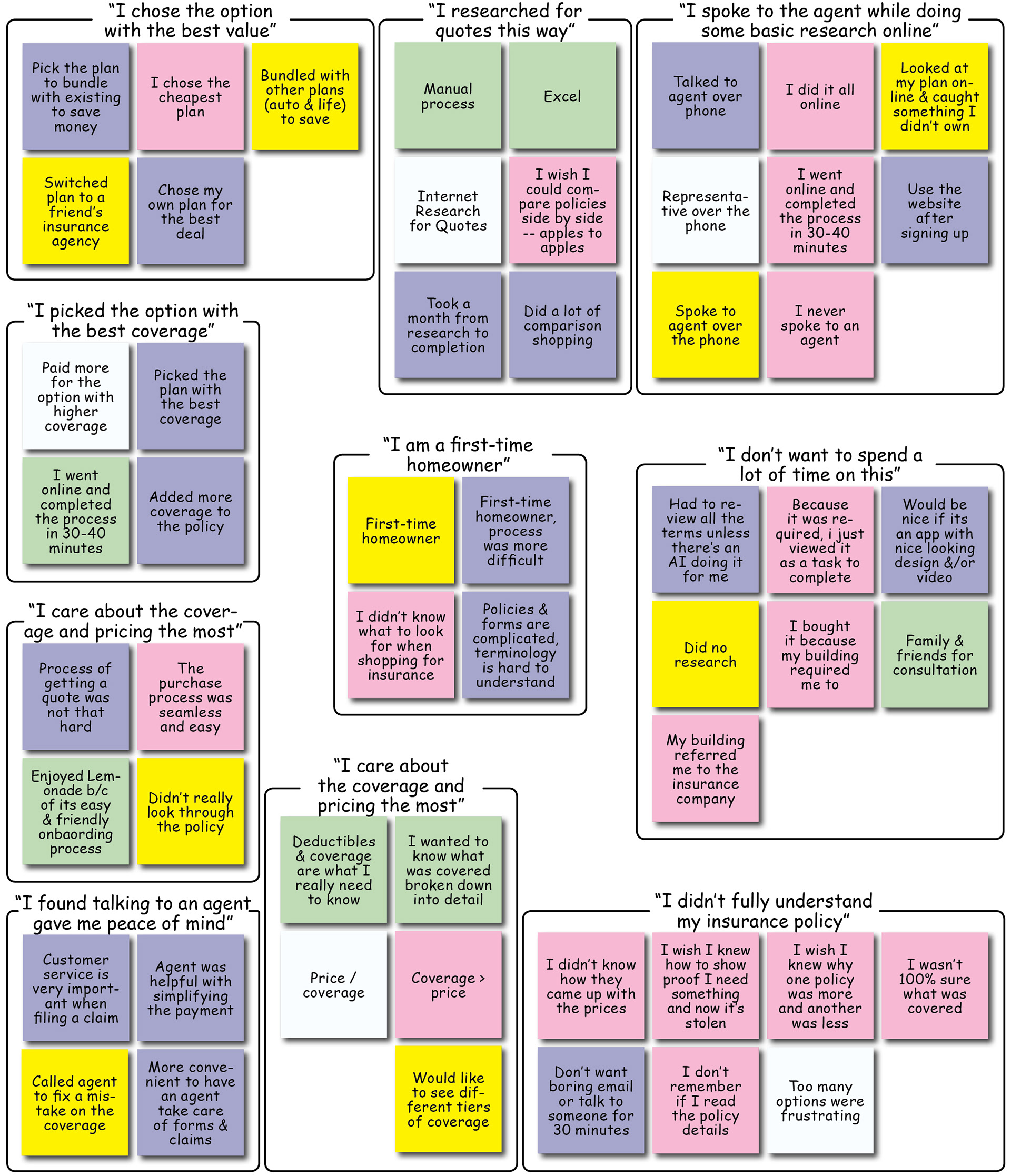
Affinity map to synthesize responses from user interviews
We interviewed five more people who were actual Better.com users who opted-out of the Better Cover process. Their responses proved to be invaluable. Here are just a handful of some of the key insights from all ten interviews:
• Users don’t want to talk to an agent — the agent is gonna try to sell to them
• However, users think talking to an agent can give them a deal or lower their price
• When given a phone number to call an insurance company, users weren’t sure if they had to start the process all over again; or that the agent may try to sell to them; or up-sell them.
• Ask for insurance earlier in the mortgage process. Some homebuyers start thinking about getting insurance way before they lock in their rate.
• Brand recognition matters when choosing insurance company.
• Price is the biggest concern
• Getting insurance is a requirement, so they’ll just get the cheapest
• Some users get the cheapest option hoping to never use their insurance/file a claim
• In order of importance: price, coverage, than deductible
• Opt-outers all researched manually and went to other insurance companies to compare premiums.
• Many of the opt-outers had insurance already.
• Some of the opt-outers did not know plans were customizable.
• Users assumed the quotes shown were the lowest/most basic coverage, and used those prices to get customers to click through to their site and up-sell them.
• When clicking out to another insurance site, users want their info pre-populated.
• Users felt adjusting their insurance would be a hassle.
• Most of the Better Mortgage customers preferred doing everything online without talking to an agent.
Based on those insights, we created our persona: Frank, the Family Man, along with a user journey to walk along his process of purchasing homeowners insurance.
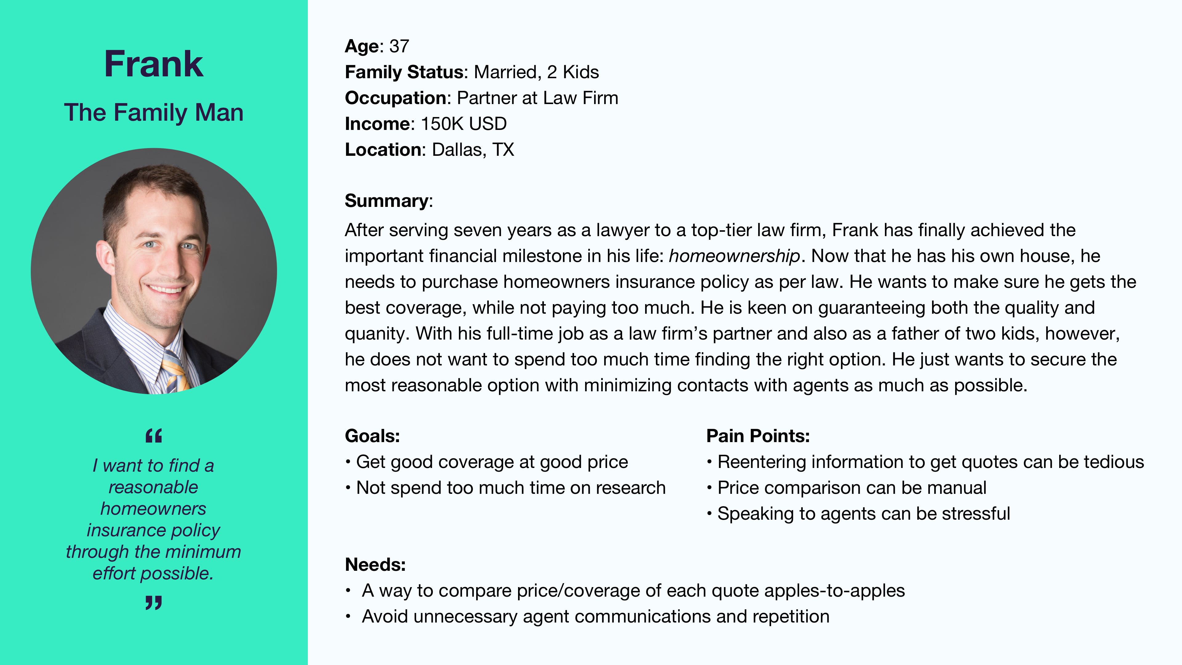
Our persona of Frank, the family man
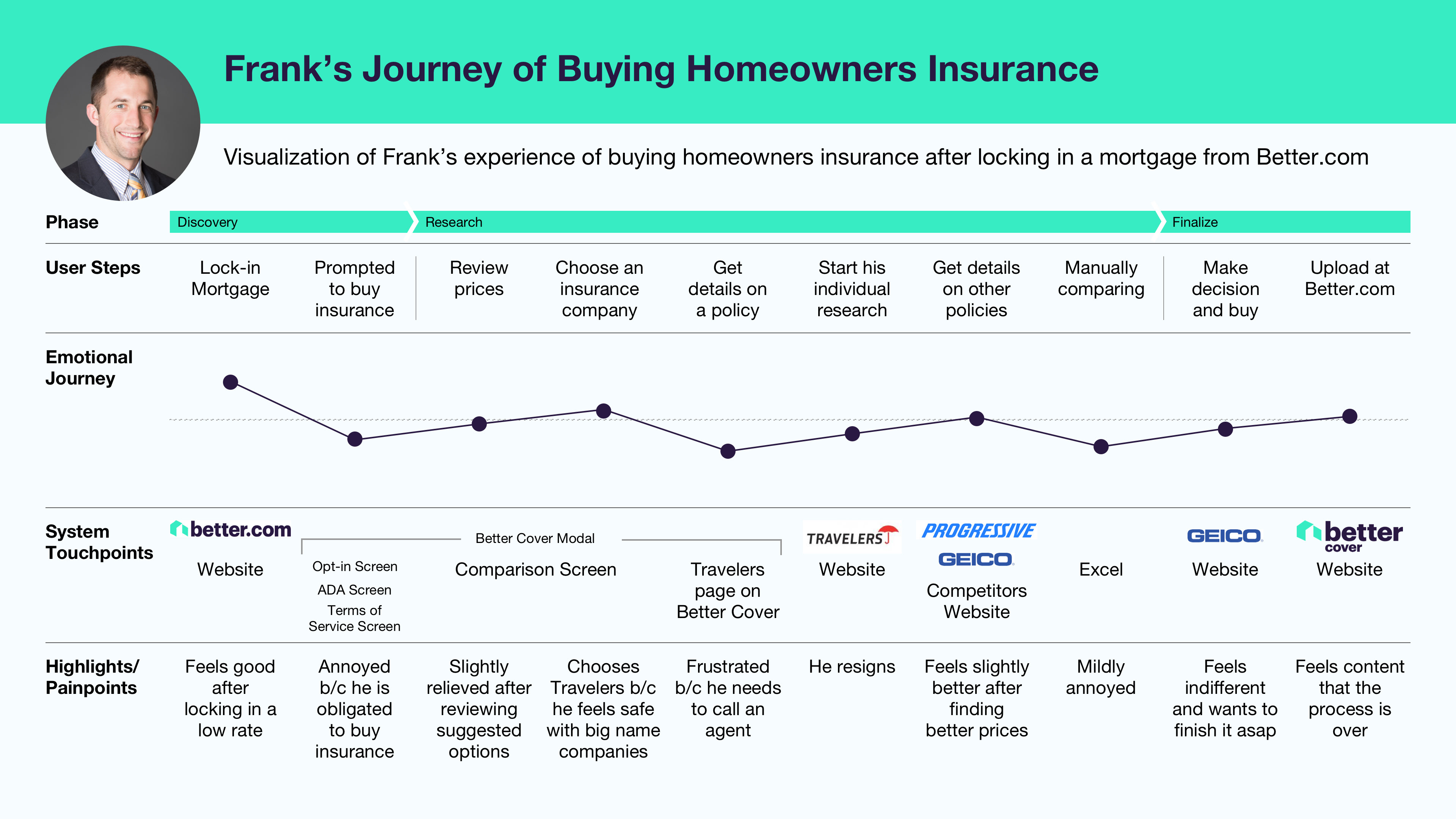
A user journey of Frank purchasing homeowners insurance
Problem statement:
How might we…
Provide Frank with a way of browsing homeowners insurance policies without spending too much time and giving him the option to contact an agent?
Design Solution
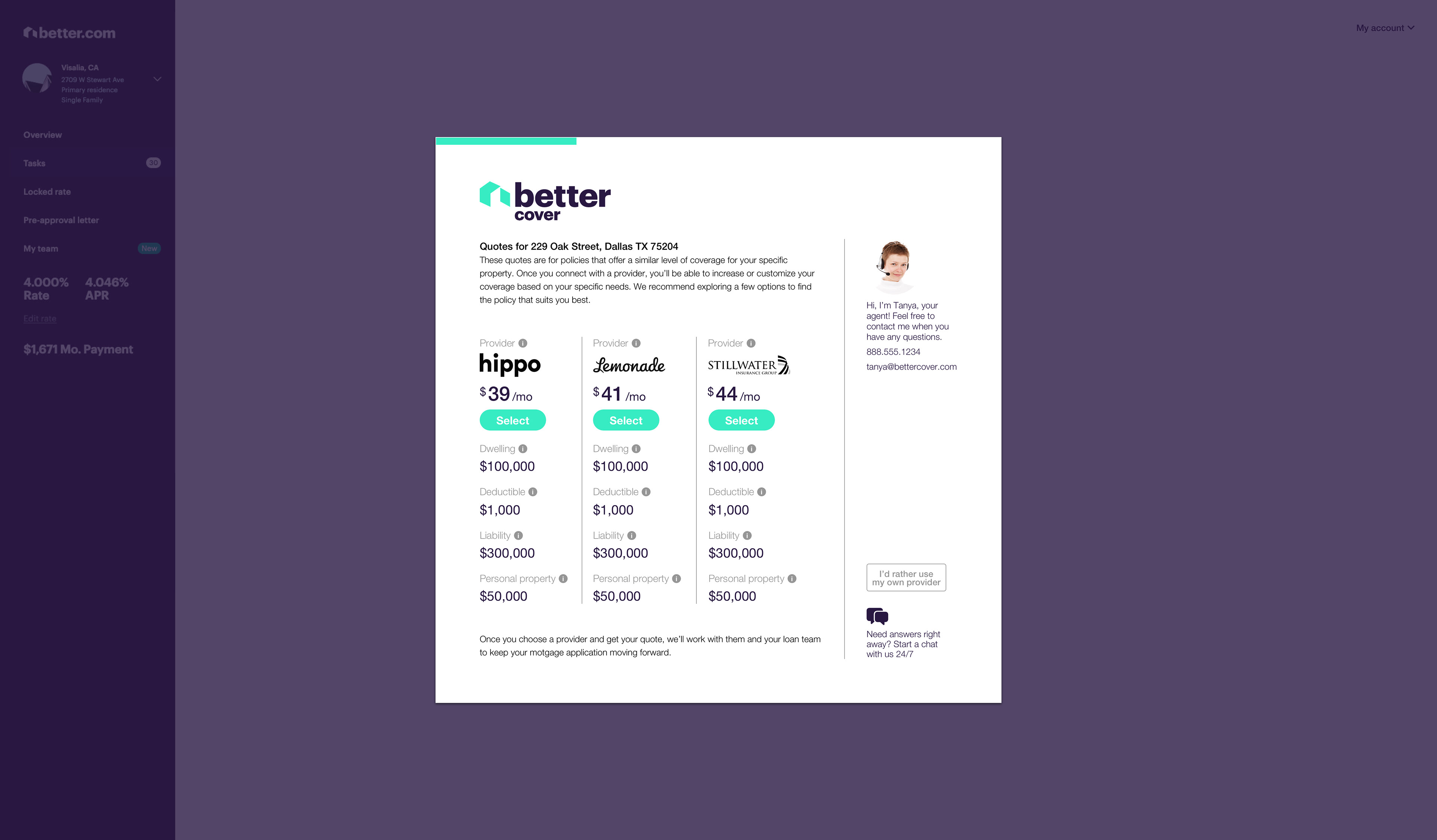
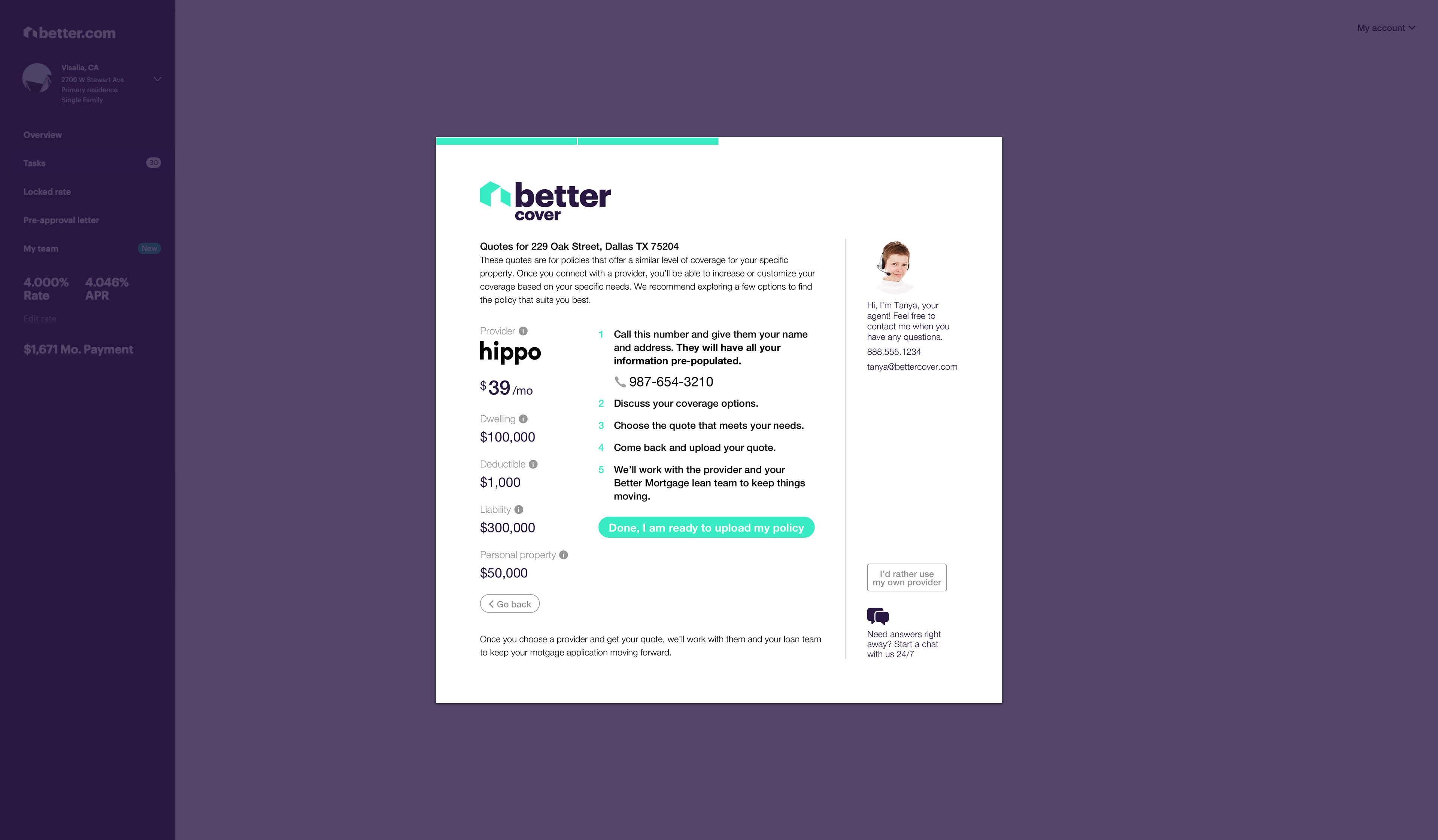
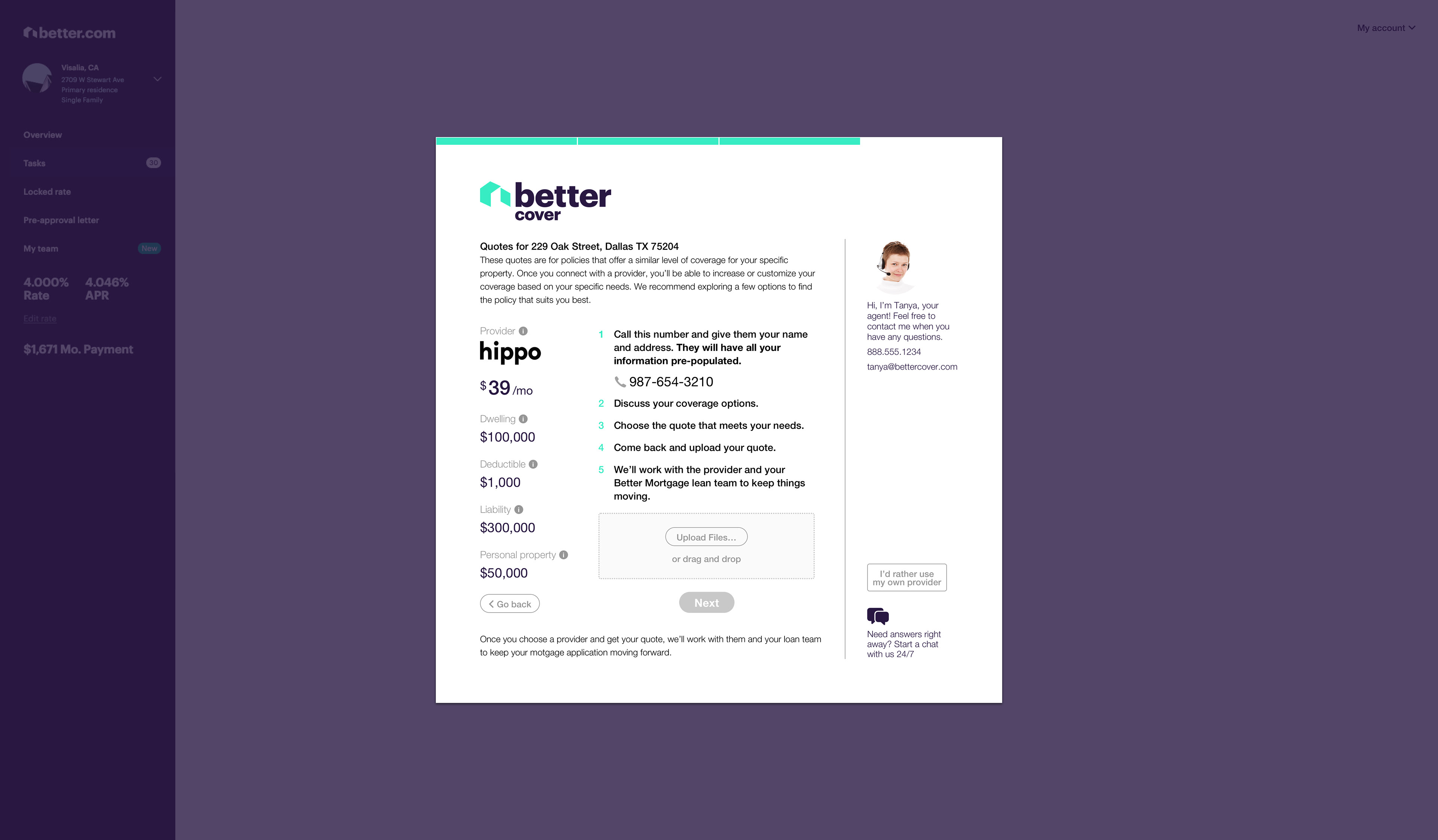
With our persona/insights in mind, along with some heuristic principles/best practices, our team decided to incorporate the following designs:
• Options to contact an agent or customer service
• More conversational language to demystify the process
• Easy to read vertical price comparison chart
• A progress bar
• Adjustable coverage amount
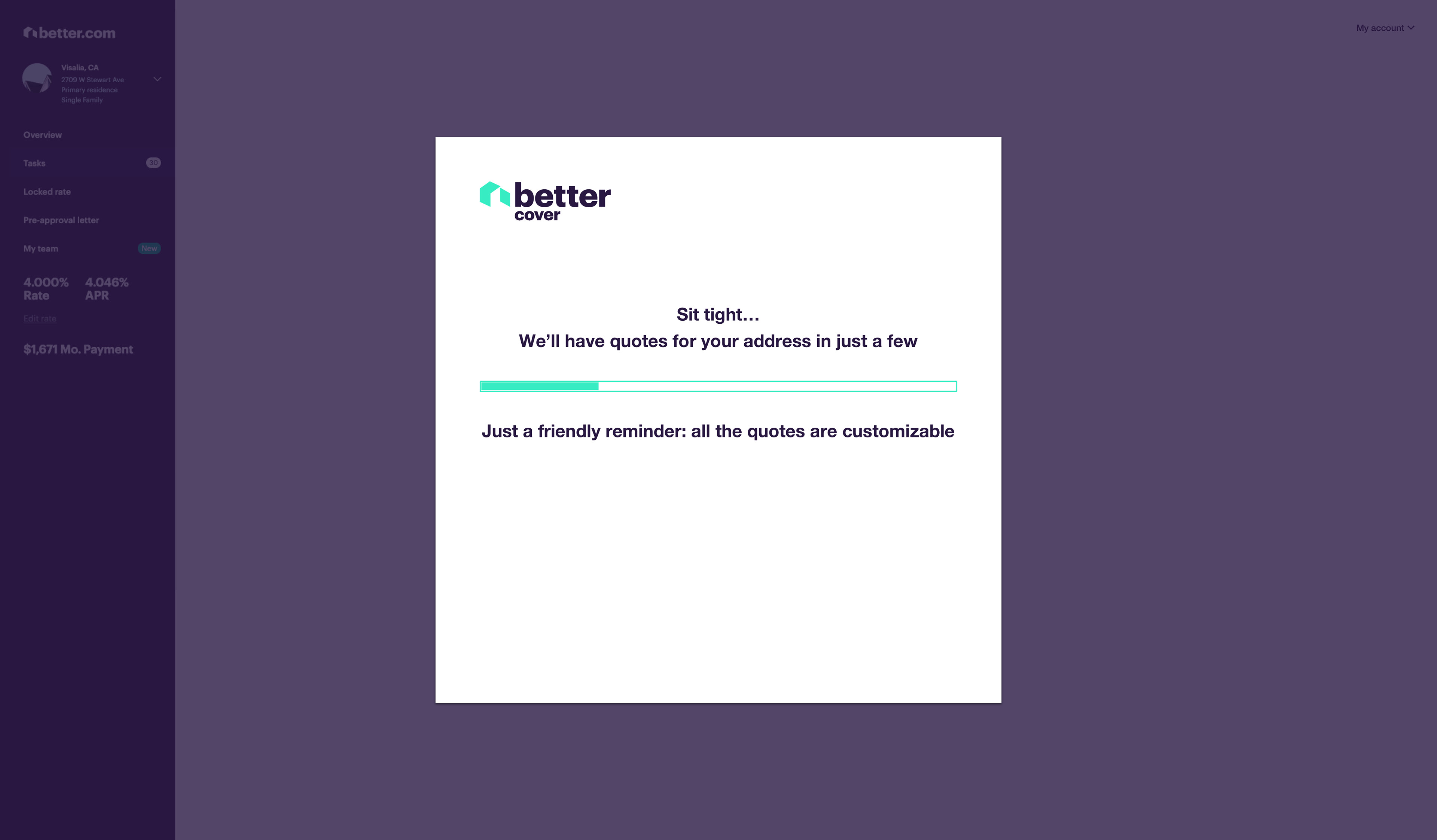
To start ideating on those designs, our UX team conducted a design studio with the BetterCover team. With those sketches in mind we came up with the following mockups:
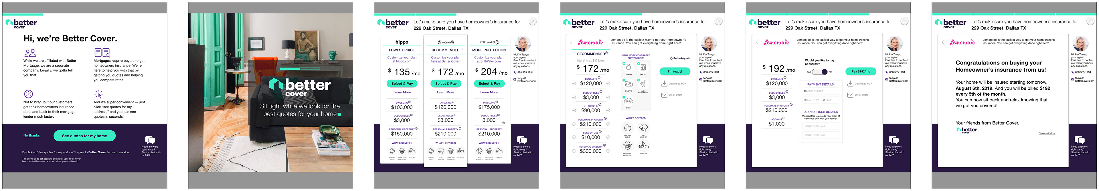
First iteration of mockups
Our team created a prototype with these screens and tested them on people with home insurance. While the prototype was overall well received, there were opportunities for improvement. Some of the feedback we addressed were:
“I didn’t realize the plans are adjustable.”
“I’m not committed to pay for this plan, I’m scared to click on the ‘Select & Pay’ button.”
“The purchase page was a little confusing.”
To address those findings, our team created a second iteration of the modal. Below are those mockups:
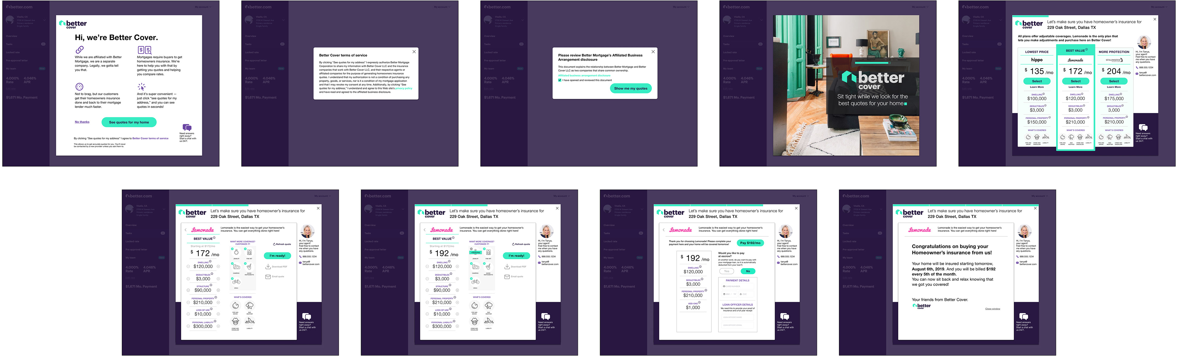
Second iteration of mockups
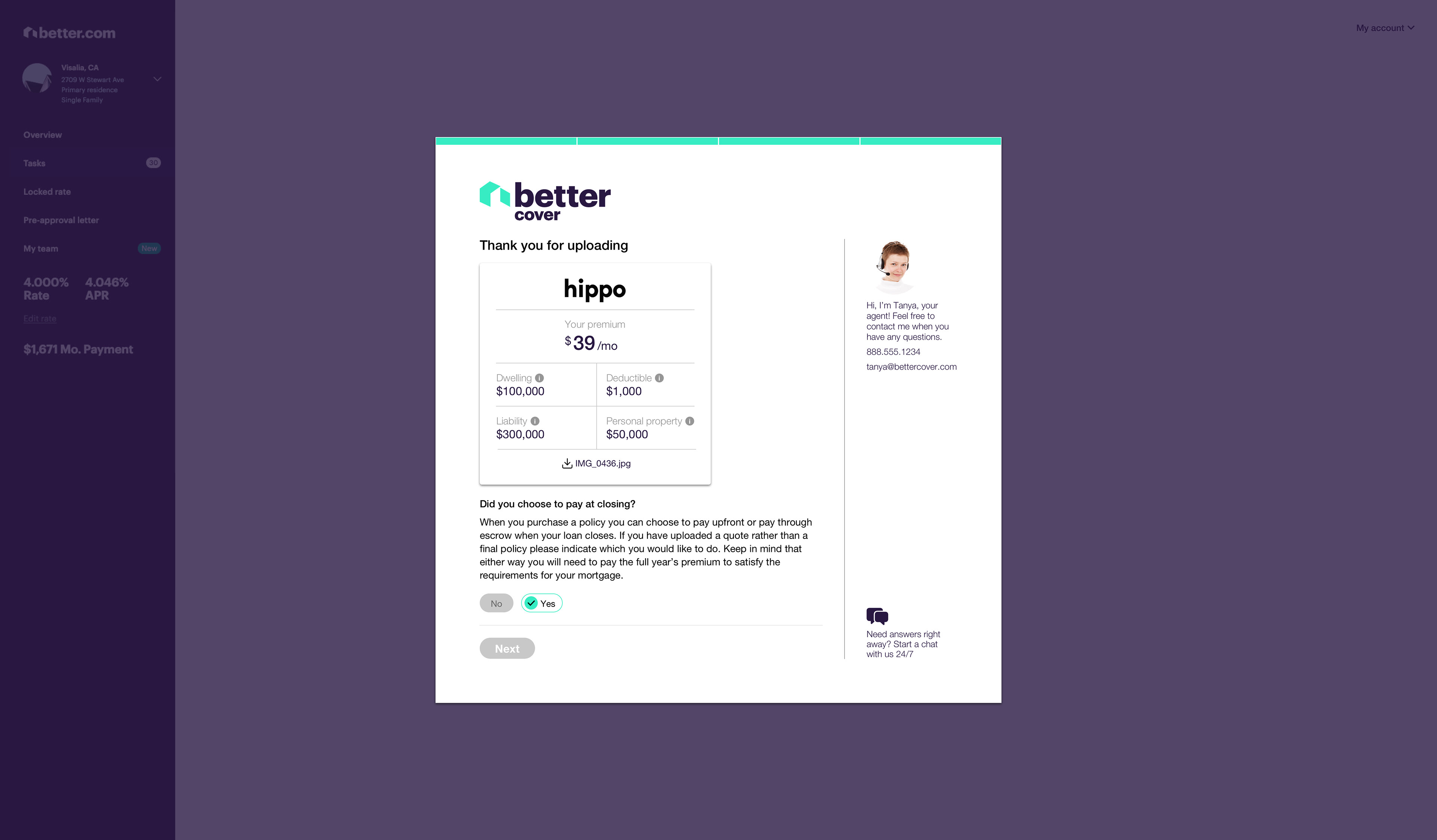
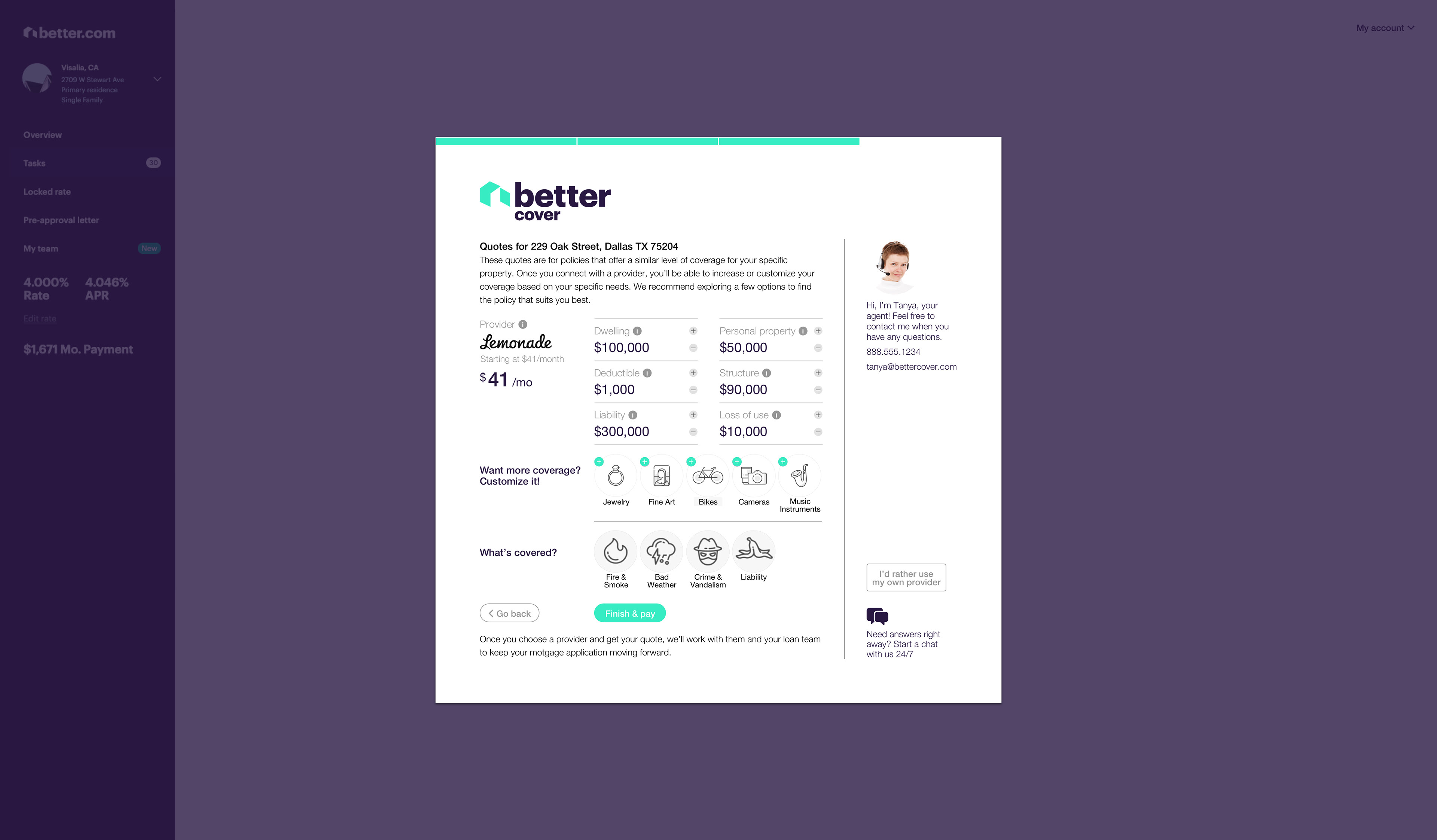
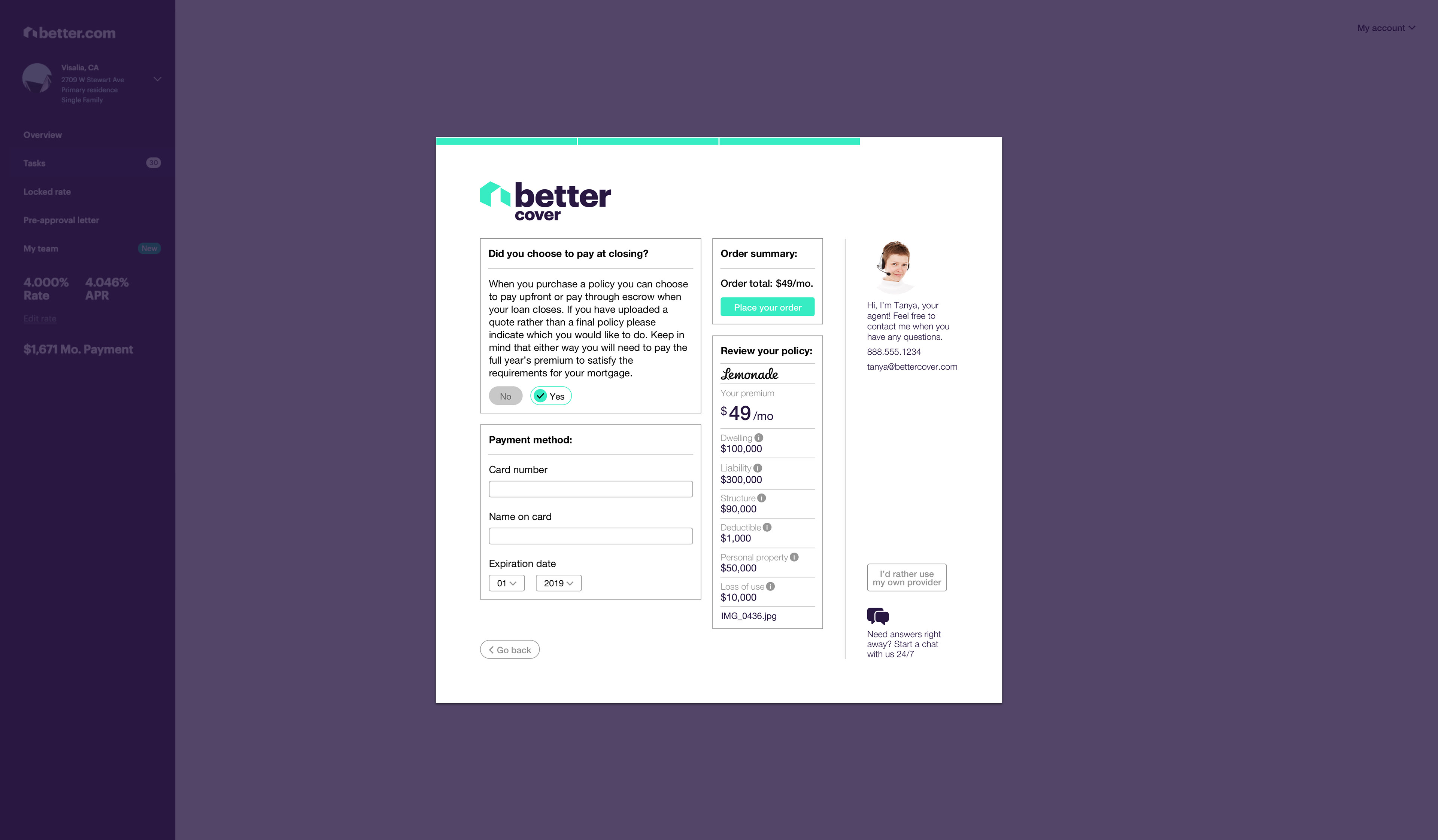
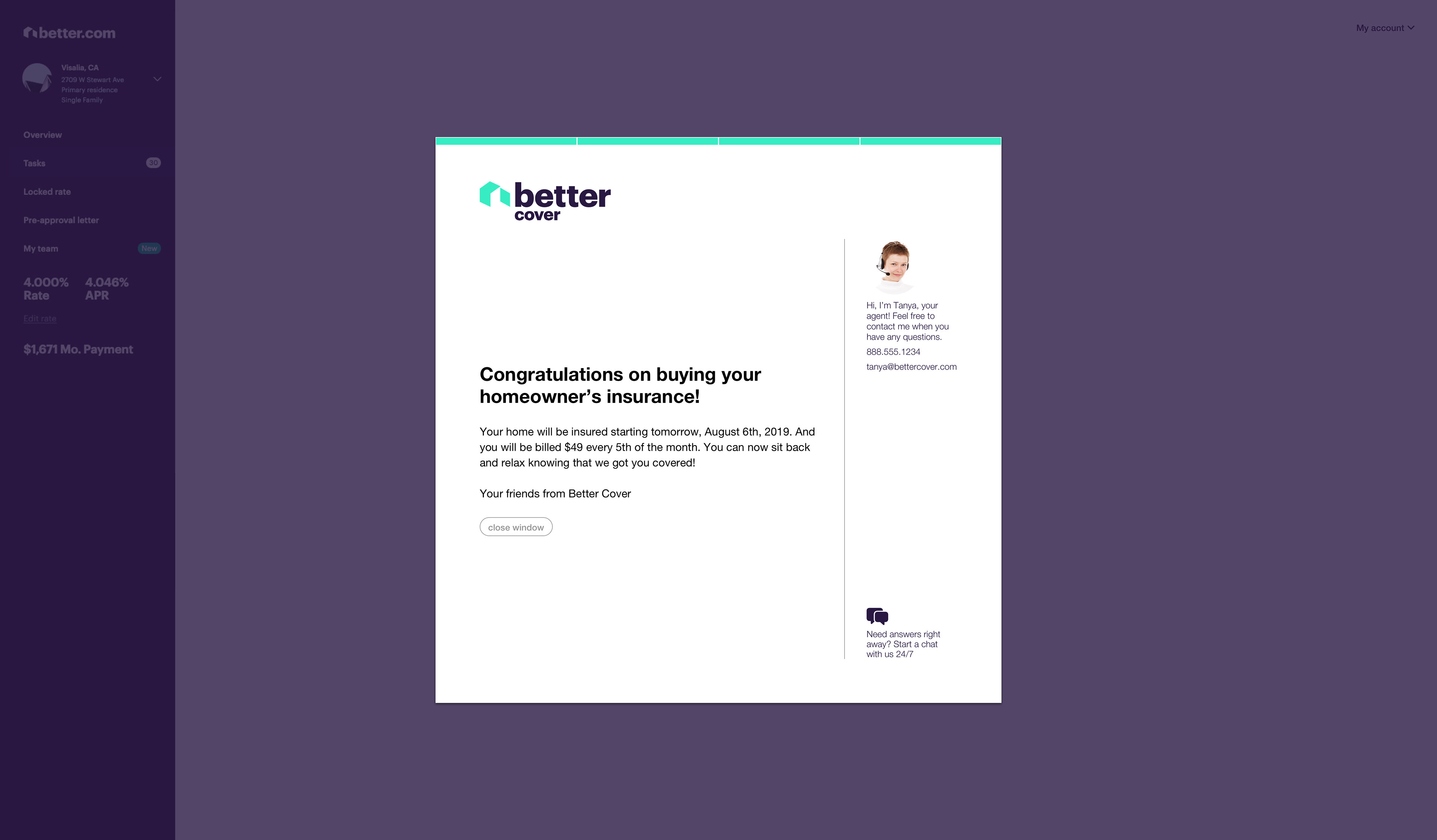
After a heuristic evaluation and some more user feedback, we did a third iteration. Below are those mockups:
Key performance indicators
Increase customers clicking on ‘see quotes’
(opt-in rate)
(opt-in rate)
Increase customers purchasing insurance
(conversion rate)
next steps
Another round of usability tests with our second iteration
• Conduct user interviews with customers who opted-out with the Better Cover screens in front of them — they were all walking through the process by memory
• Look into introducing BetterCover earlier in the mortgage process — many of the customers were considering buying home insurance before they locked in their mortgage rate
• Conduct user interviews on customers who refinance, and develop a persona for them — we focused on first-time home buyers in our interviews
Reflection
Working with very specific constraints was both challenging and fun. Initially, working for an insurance product within a modal and designing just several screens sounded very limiting. Once I started the research though, I realized there was just plenty of room for creativity and addressing the problems, required a lot of creative thinking.